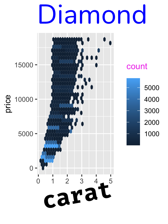
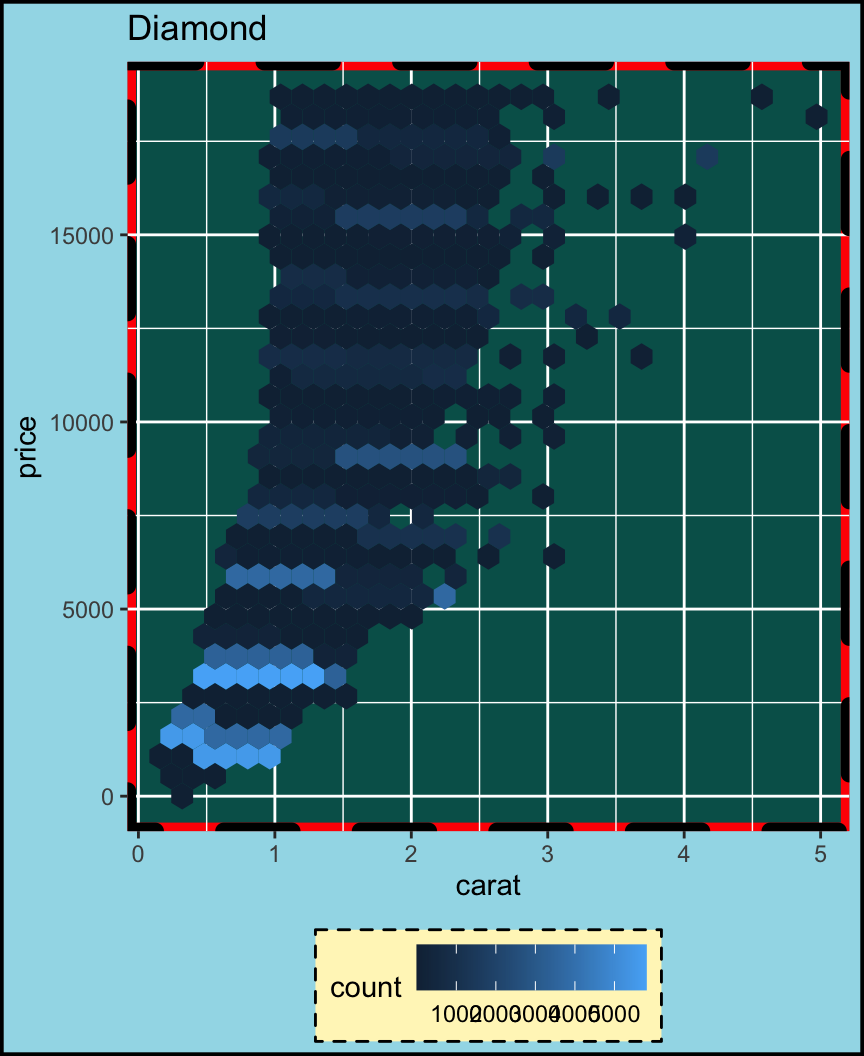
ggplot(diamonds, aes(carat, price)) +
  geom_hex() +
  labs(title = "Diamond") +
  theme(
    axis.title.x = element_text(
      size = 30,
      face = "bold",
      angle = 10,
      family = "Fira Code"
    ),
    legend.title = element_text(
      color = "#ef42eb",
      margin = margin(b = 5)
    ),
    plot.title = element_text(
      size = 35,
      family = "Nunito",
      color = "blue"
    )
)theme: modify the look of texts
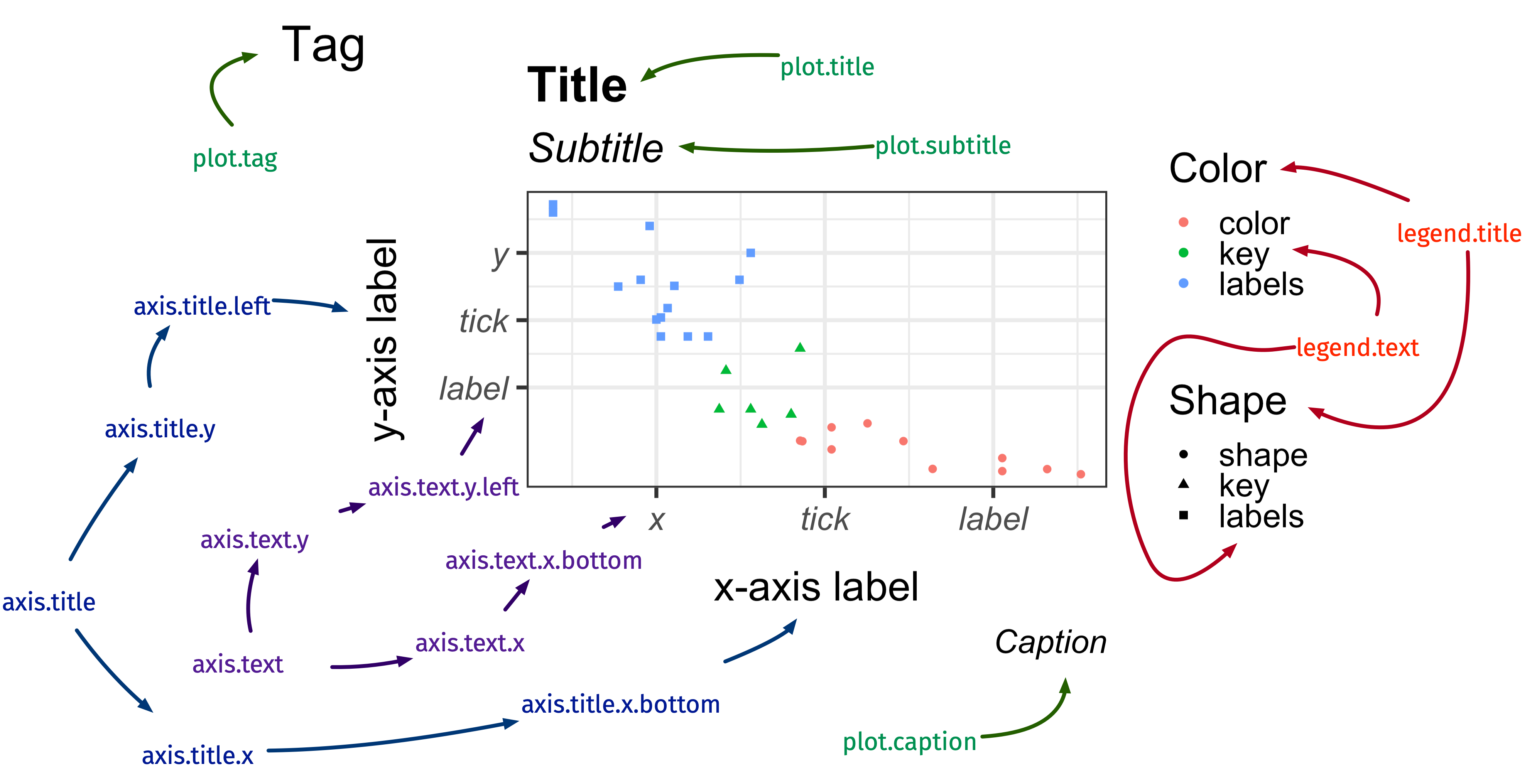
element_text()
element_text()
- Modify any text in the plot as you like it!
theme: modify the look of the lines
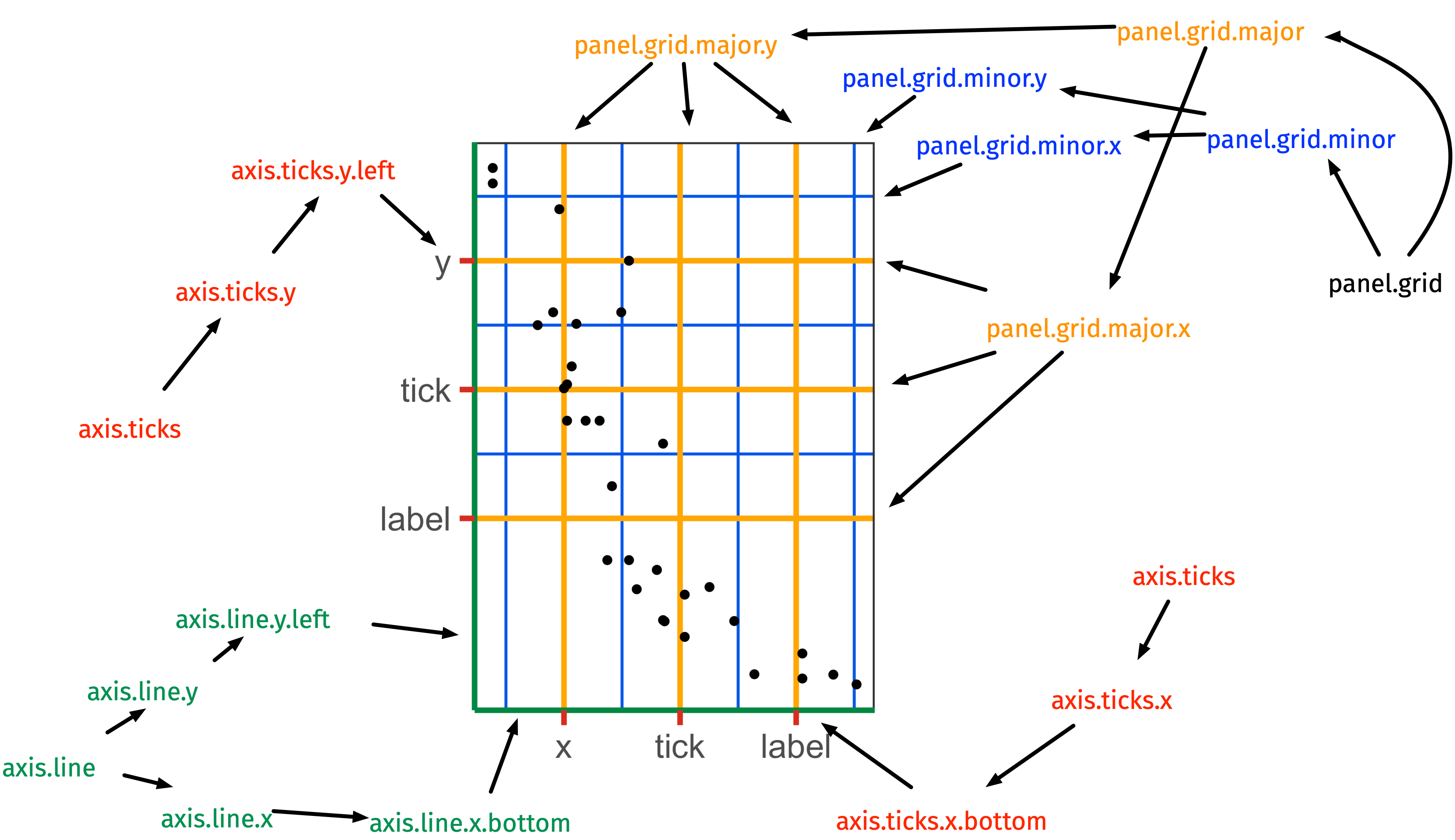
element_line()
element_line()
- If there’s a line in the plot that’s not data related, then it’s generally controlled in the
themewithelement_line().
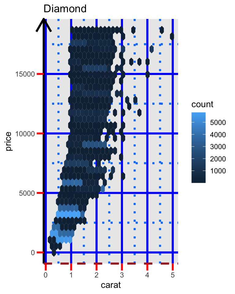
ggplot(diamonds, aes(carat, price)) +
  geom_hex() +
  labs(title = "Diamond") +
  theme(
    axis.line.y = element_line(
      color = "black",
      size = 1.2,
      arrow = grid::arrow()
    ),
    axis.line.x = element_line(
      linetype = "dashed",
      color = "brown",
      size = 1.2
    ),
    axis.ticks = element_line(color = "red", size = 1.1),
    axis.ticks.length = unit(3, "mm"),
    panel.grid.major = element_line(color = "blue",
                                    size = 1.2),
    panel.grid.minor = element_line(
      color = "#0080ff",
      size = 1.2,
      linetype = "dotted"
    )
  )
theme: modify the look of the
rectangular regions
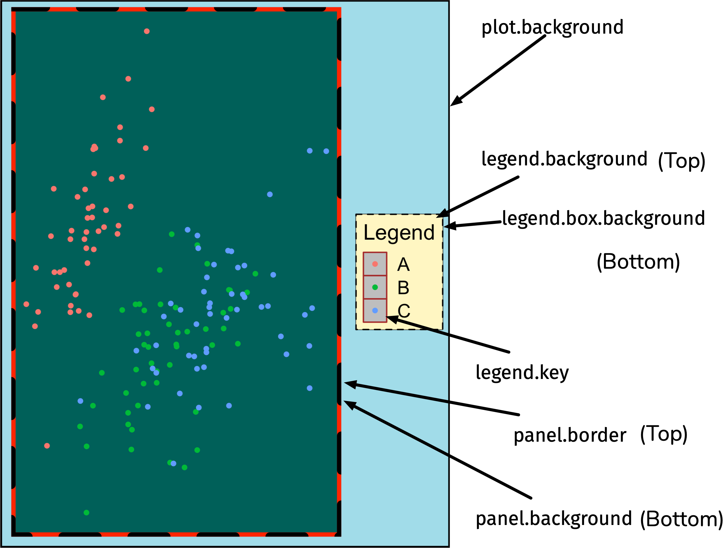
element_rect()
element_rect()
ggplot(diamonds, aes(carat, price)) +
  geom_hex() +
  labs(title = "Diamond") +
  theme(
    legend.background = element_rect(
      fill = "#fff6c2",
      color = "black",
      linetype = "dashed"
    ),
    legend.key = element_rect(fill = "grey", color = "brown"),
    panel.background = element_rect(fill = "#005F59",
                                    color = "red",
                                    size = 3),
    panel.border = element_rect(
      color = "black",
      fill = "transparent",
      linetype = "dashed",
      size = 3
    ),
    plot.background = element_rect(fill = "#a1dce9",
                                   color = "black",
                                   size = 1.3),
    legend.position = "bottom"
  )
The selected colors don’t make it a pretty plot but it’s easier to distinguish between the different rectangular elements.
Let’s make some polished plots!
45:00
> Go to emitanaka.org/dataviz-workshop/exercises/
> Click Exercise 7
> This is the last practice session – feel free to ask questions!