Scales
- Scales control the mapping from data to aesthetics
- They usually come in the format like below:

- E.g.
scale_x_continuous(),scale_fill_discrete(),scale_y_log10()and so on.
Guide
- The scale creates a guide: an axis or legend
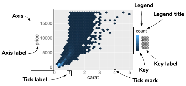
- To modify these you generally use
scale_*,guide_*withinguidesor other handy functions (e.g.labs,xlab,ylab, and so on).
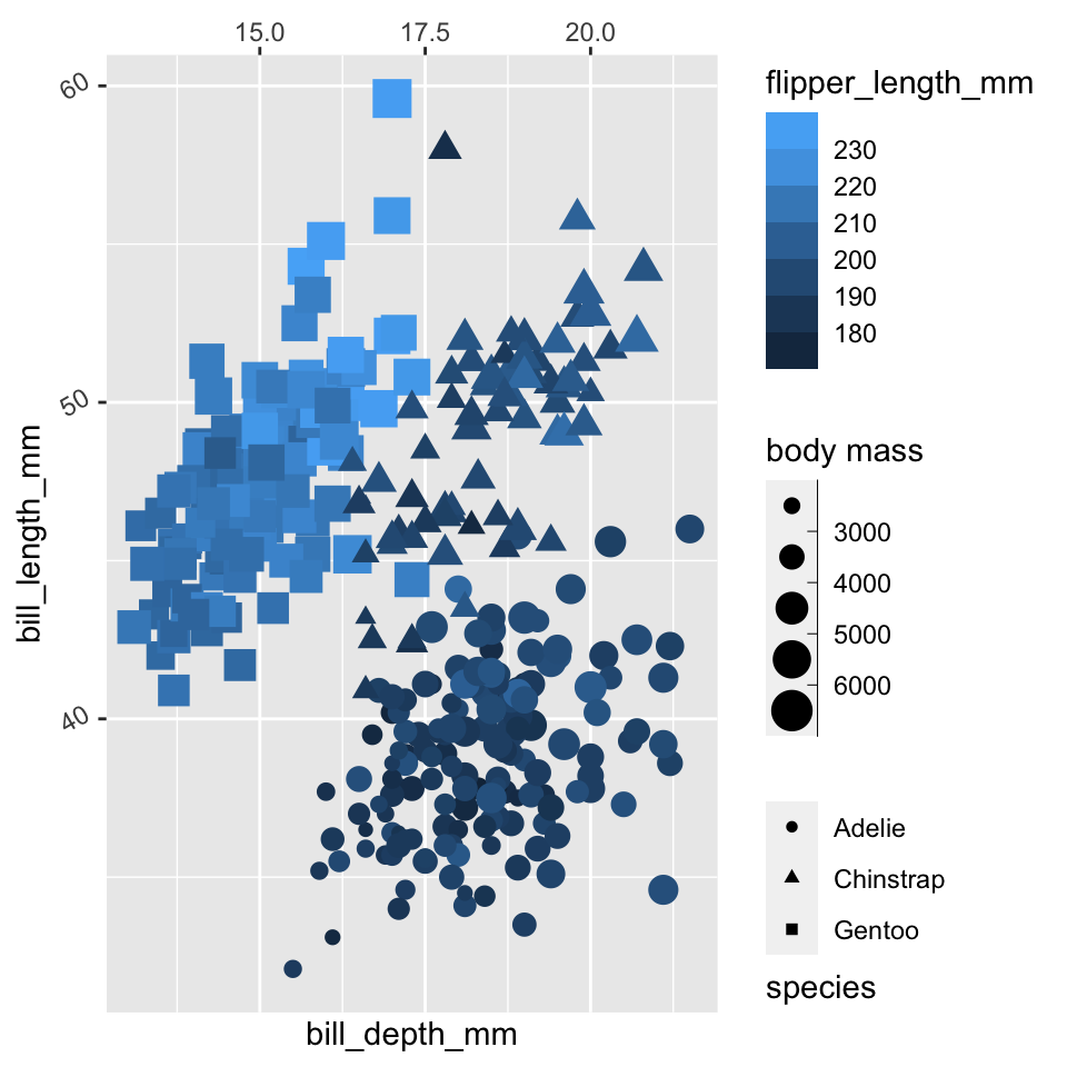
Guides for scales
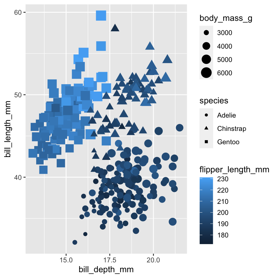
Guides for scales

Guides for scales
library(palmerpenguins)
ggplot(penguins,
       aes(x = bill_depth_mm,
           y = bill_length_mm,
           color = flipper_length_mm,
           shape = species,
           size = body_mass_g)) +
geom_point() +
guides(
x = guide_axis(position = "top"),
y = guide_axis(angle = 30),
color = guide_colorsteps(order = 1),
shape = guide_legend(title.position = "bottom"),
size = guide_bins(title = "body mass")
)
Modifying axis
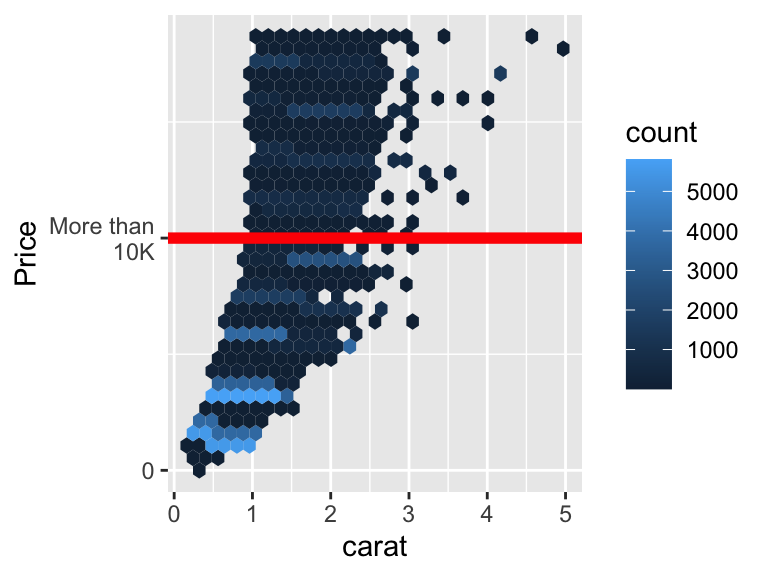
- Notice how the axis title has been modified to “Price”
- The breaks are at 0 and 10000
- And the associated labels for the breaks are “0” and “More than 10K”
Modifying labels
- Sometimes you may want to modify the labels based on it’s existing axis label.
- You can give a function to the label instead.
- Most of the handy functions are in the
scalespackage.
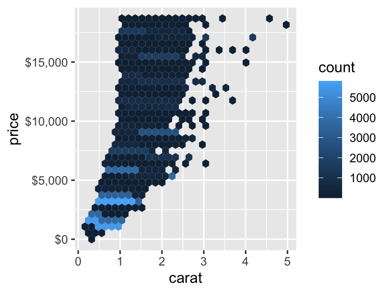
Modifying legend scale
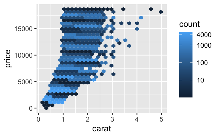
- An axis is not just the x-axis and y-axis!
- The legend can have an axis and we can modify its scale as well.
- We transform the scale into a
log10format with breaks defined at 0, 10, 100, 1000, and 4000.
Removing legend
- If you want to remove a legend for an associated aesthetic, you can use
guide = "none"in the associated scale. - There are other handy ways of doing this as well!
Color palettes
- There are a few different color palettes… choose what suits your purpose!
Qualitative palettes
- Designed for categorical variable with no particular ordering
colorspace::hcl_palettes("Qualitative", plot = TRUE, n = 7)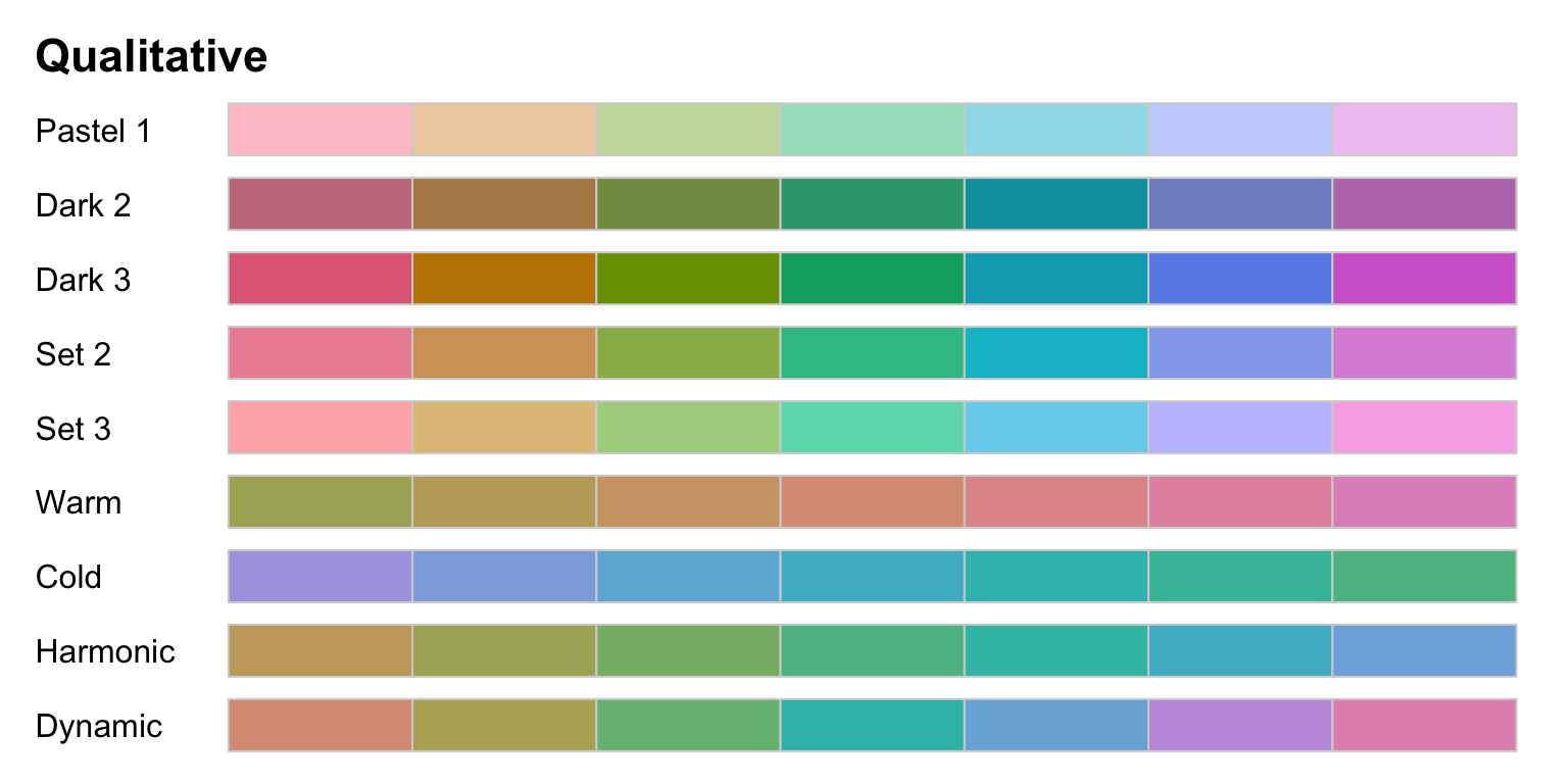
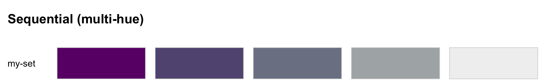
Sequential palettes
- Designed for ordered categorical variable or number going from low to high (or vice-versa)
colorspace::hcl_palettes("Sequential", plot = TRUE, n = 7)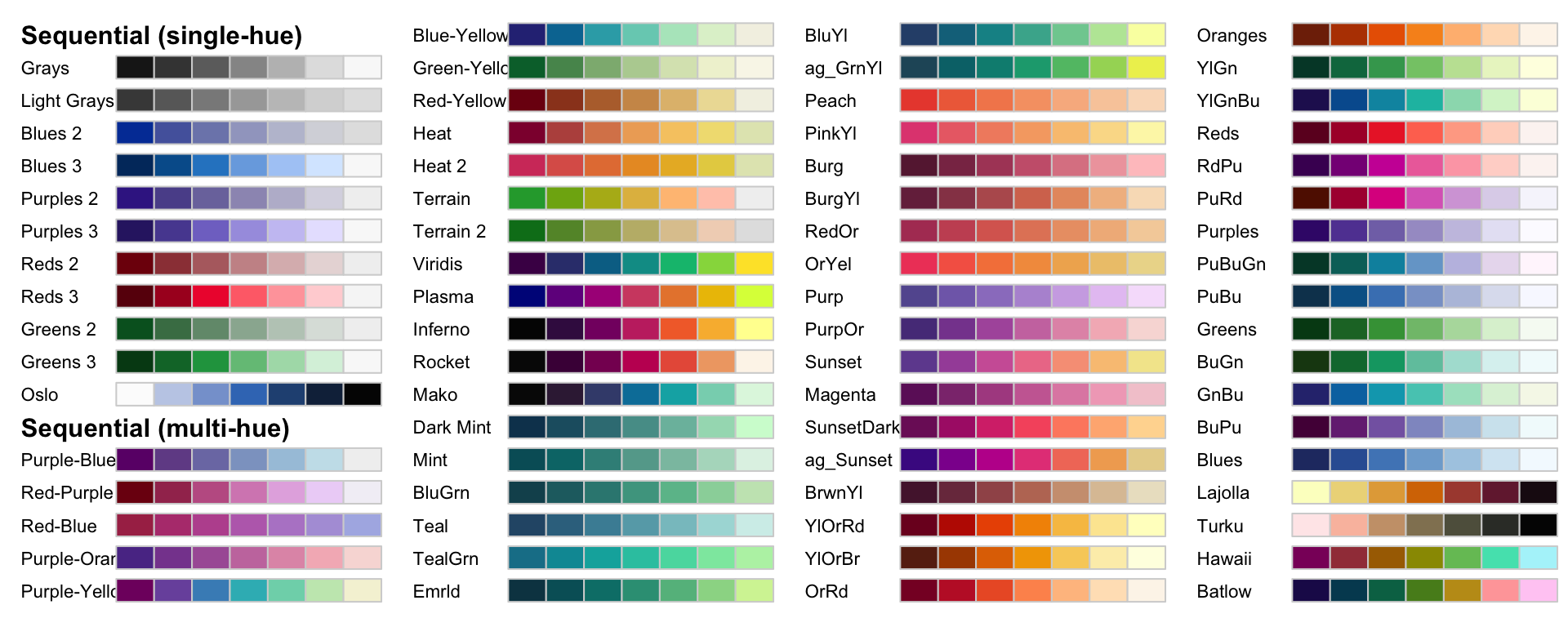
Diverging palettes
- Designed for ordered categorical variable or number going from low to high (or vice-versa) with a neutral value in between
colorspace::hcl_palettes("Diverging", plot = TRUE, n = 7)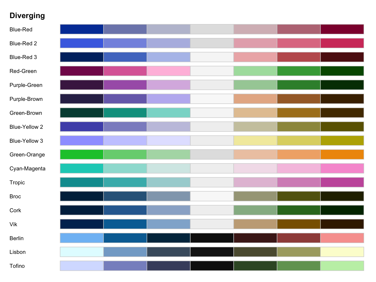
hcl_wizard
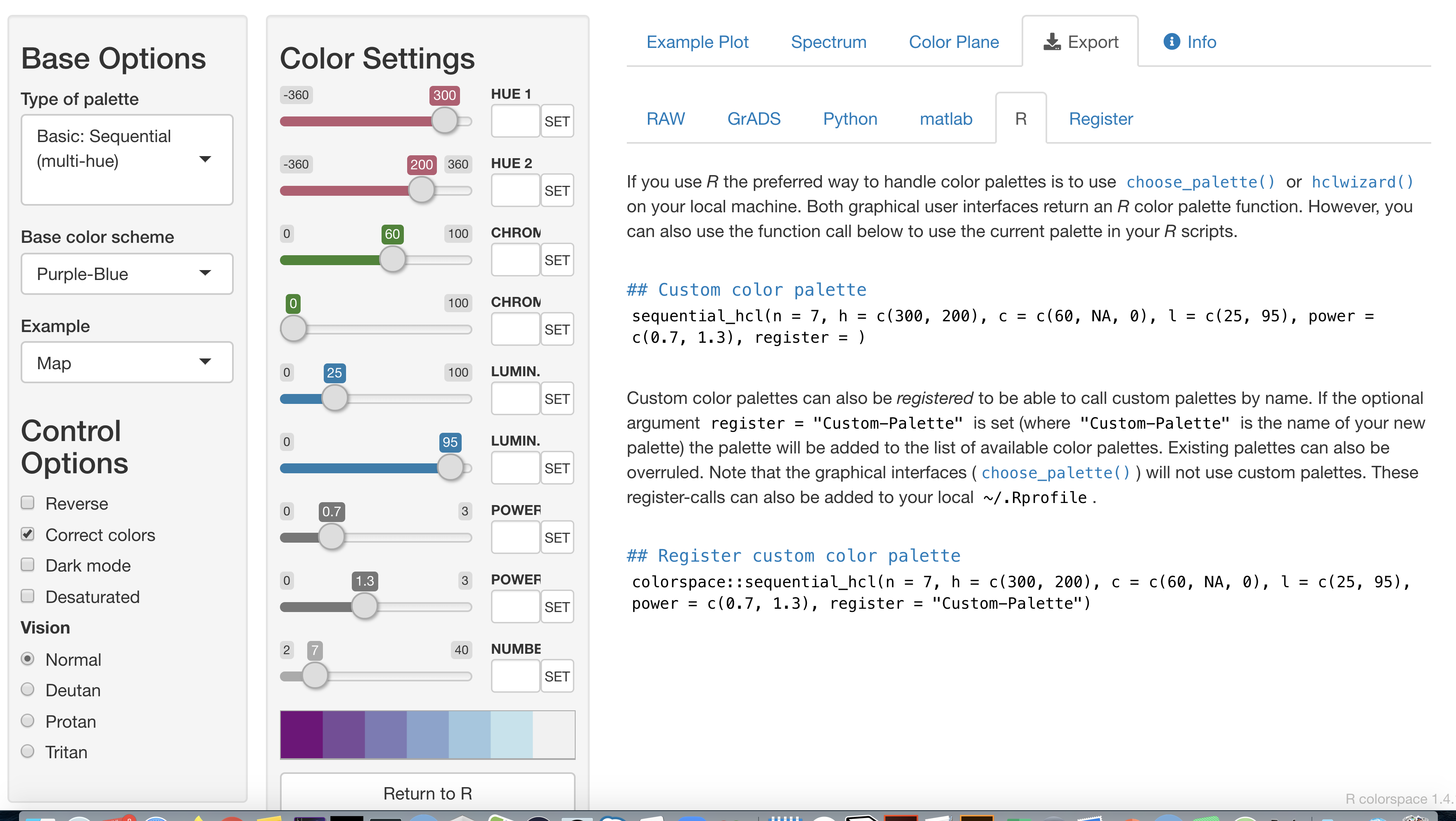
Choose your palette > Export > R > Copy the command
Registering your own palette
Applying your own palette with scale_
Combining with ggplot:
Manually selecting colors
Colorblindness
Colorblindness affect roughly 1 in 8 men.
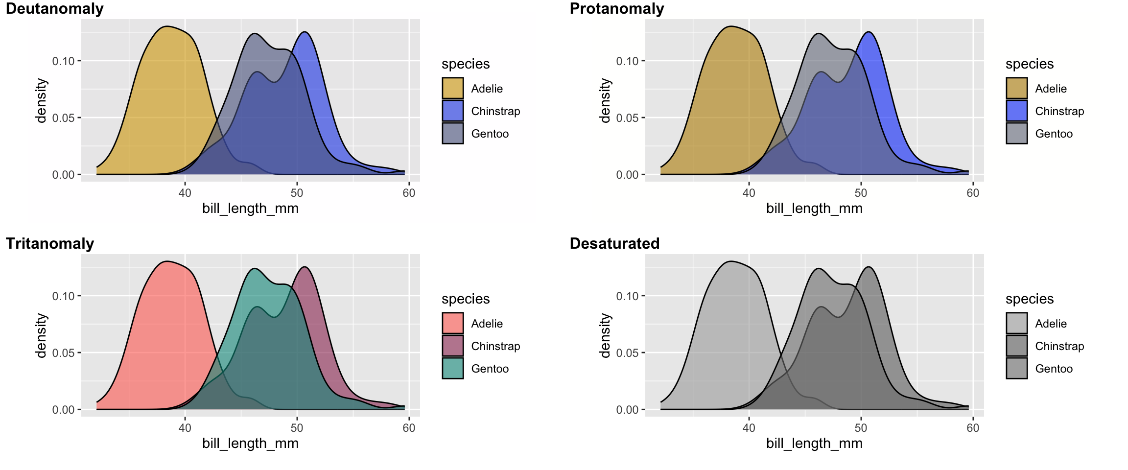
Check your color choices using the colorblindr package or otherwise.
Your turn!
30:00
> Go to emitanaka.org/dataviz-workshop/exercises/
> Click Exercise 5