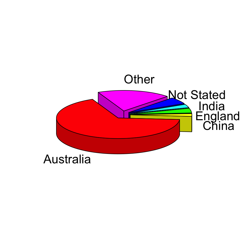
Which category is the largest?
Elementary Perceptual Tasks
Non-exhaustive


Rank 1
Example


Rank 2
Example

Rank 3
Example

Rank 4
Example

Rank 5
Example

Rank 6
Example


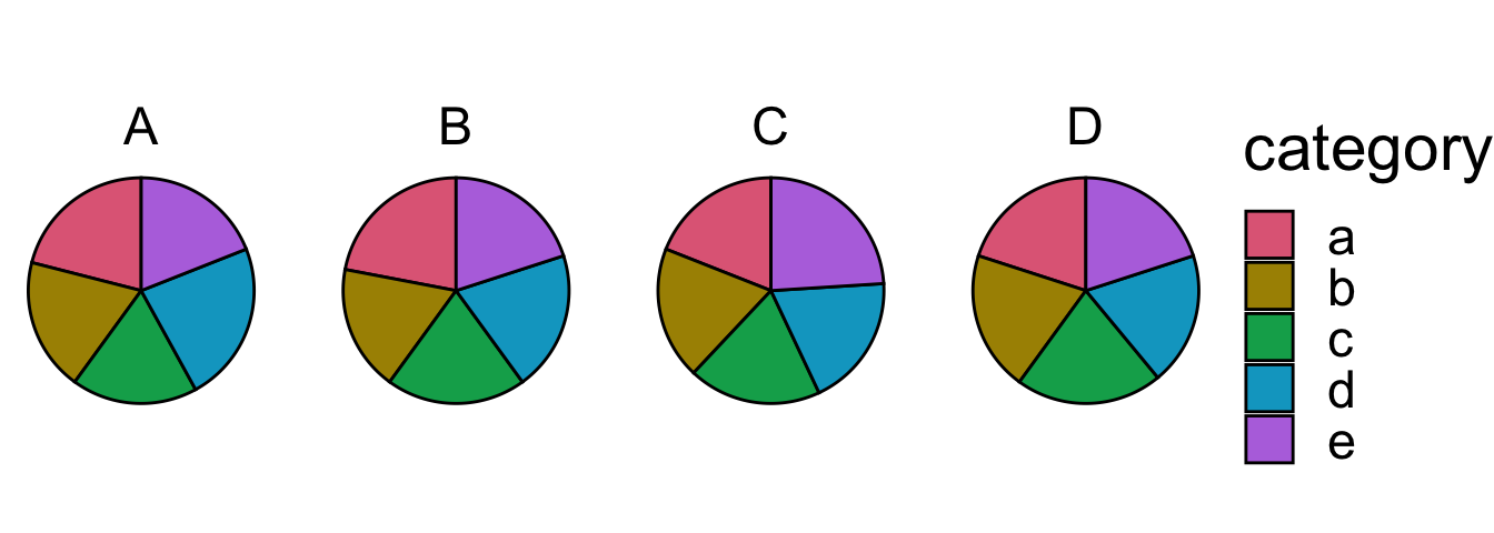
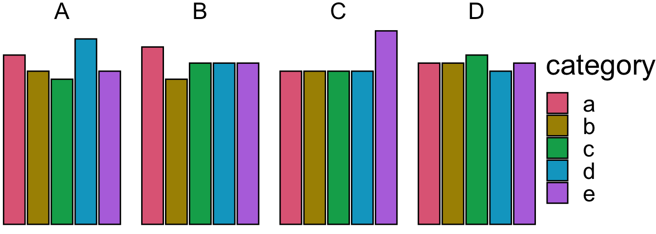
Preattentive processing
- Viewers can notice certain features are absent or present without focussing their attention on particular regions.
- Which plot helps you to distinguish the data points?


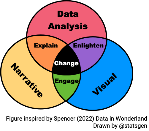
Data story
- Storytelling is a powerful technique to communicate data
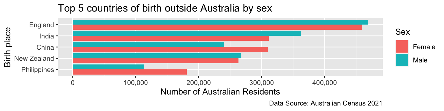
Law of Proximity
- By placing elements closer together, it makes it easier for you to group elements together as well as make comparisons.
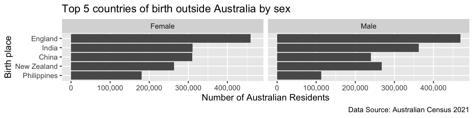
Can you tell which birth place have more women than men amongst the Australian residents?
Law of Proximity
Data story
Census 2021 shows far more women born in Phillipines and China migrate to Australia than men born in their respective countries, whilst more men born in India migrate to Australia than women born in India.
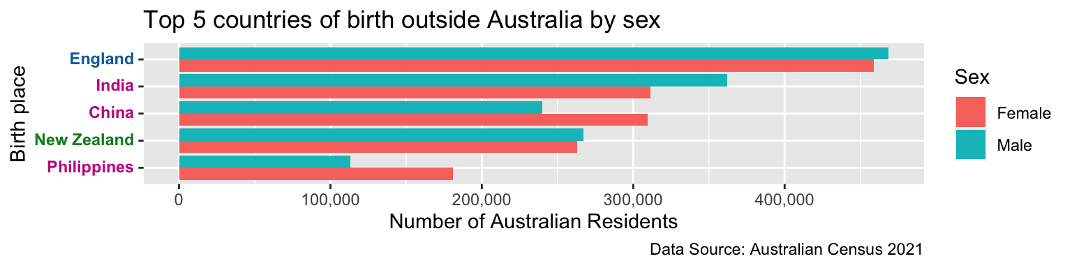
Law of Similarity
- When objects share similar attributes, they are perceived as being part of the same group.
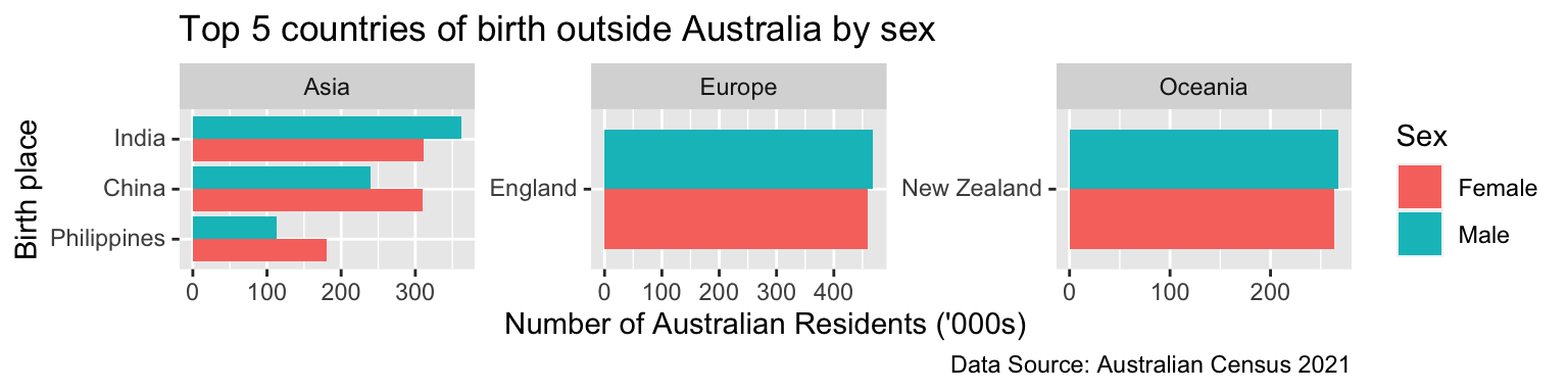
Notice that the countries are colored by their continent (Europe, Asia, and Oceania).
Law of Closure
- Objects collected within a boundary-like structure are perceived as a group.
Sharing your data visualisation and data story