Communicating with data

Communicating

To effectively communicate, we must realize that we are all different in the way we perceive the world and use this understanding as a guide to our communication with others.

– Anthony Robbins


Communicating with data

The two words ‘information’ and ‘communication’ are often used interchangeably, but they signify quite different things. Information is giving out; communication is getting through.

– Sydney J. Harris


Effective communication

  • There is no single, ideal way to communicate
  • Competence is situational and relational (where, what and who)
  • Communication doesn’t always require complete understanding
  • We notice some messages more and ignore others, e.g. we tend to notice messages that are:
    • intense,
    • repetitious, and
    • constrastive.
  • We are influenced by what is most obvious

Telling stories with data

No one ever made a decision because of a number. They need a story.

– Daniel Kahneman


  • Storytelling is a powerful technique to communicate data

Principles of communicating data

  1. Know your goal (target audience, intended message, desired effect)
  2. Use the right data
  3. Select suitable visualisations
  4. Design for aesthetics
  5. Choose an effective medium and channel
  6. Check the results, i.e. get feedback

Elements of statistical persuasion

  • Magnitude of effects: the strength of a statistical argument is enhanced in accord with the quantitative magnitude of support for its qualitative claim.
  • Articulation of results: the degree of comprehensible detail in which conclusions are phrased.
  • Generality of effects: the replicability of the results.
  • Interestingness of argument: the potential to change people believe.
  • Credibility of argument: the believability of a claim.

Data journalism

Five rules for evidence communication

  1. Inform, not persuade
  2. Offer balance, not false balance
  3. Disclose uncertainties
  4. State evidence quality
  5. Inoculate against misinformation

Code of Practice for Statistics

The Code of Practice for Statistics ensures that statistics are not just numbers, but reliable tools for understanding the world, providing insight to inform understanding and shape action.


The Code Principles

Trustworthiness

  1. Show integrity
  2. Lead responsibly
  3. Be transparent
  4. Manage data responsibly

Quality

  1. Prioritise quality
  2. Be rigorous
  3. Be open about quality

Value

  1. Be relevant
  2. Be clear
  3. Be accessible

Effective tables

Table 1

“Table 1” is most commonly the first table in a scientific or medical research paper, providing a summary of the study population’s baseline characteristics (demographics, health metrics) stratified by group.


Adelie
(N=152)
Chinstrap
(N=68)
Gentoo
(N=124)
Overall
(N=344)
Body mass (g)
Mean (SD) 3700 (459) 3730 (384) 5080 (504) 4200 (802)
Median [Min, Max] 3700 [2850, 4780] 3700 [2700, 4800] 5000 [3950, 6300] 4050 [2700, 6300]
Missing 1 (0.7%) 0 (0%) 1 (0.8%) 2 (0.6%)
Sex
Female 73 (48.0%) 34 (50.0%) 58 (46.8%) 165 (48.0%)
Male 73 (48.0%) 34 (50.0%) 61 (49.2%) 168 (48.8%)
Missing 6 (3.9%) 0 (0%) 5 (4.0%) 11 (3.2%)

What statistics to present?

  • What statistics to present depends on what you want to convey and your audience.

  • There are two key purposes of the table:

    1. display information; and
    2. communicate information.
  • In general, tables tend to be about display of information and graphs are preferred for communication.
  • However, if precision matters then tables can be better at communicating this than graphs.
  • Numerical summaries should convey the characteristics of the data, and the relationships between variables, that are relevant to the question at hand.

Contingency tables

Contingency table (also called cross-tabulation) is a type of table that displays the frequency distribution of variables, often used to explore the relationship between two or more categorical variables.

Island/Species Adelie Chinstrap Gentoo Total
Biscoe 12.8% (44) 0.0% (0) 36.0% (124) 48.8% (168)
Dream 16.3% (56) 19.8% (68) 0.0% (0) 36.0% (124)
Torgersen 15.1% (52) 0.0% (0) 0.0% (0) 15.1% (52)
Total 44.2% (152) 19.8% (68) 36.0% (124) 100.0% (344)

Numerical precision

Select an appropriate precision for your goal and audience.

Average Body Mass (g)
Species 5 d.p. 2 d.p. 0 d.p.
Adelie 3,700.66225 3700.66 3701
Gentoo 5,076.01626 5076.02 5076
Chinstrap 3,733.08824 3733.09 3733

Trailing zeroes

Display trailing zeroes to match selected precision of the column.

Trailing zeroes
Yes No
0.233 0.233
0.320 0.32
0.400 0.4
0.343 0.343

Measurement units

Change and display units as appropriate.

Average body mass
Species (g) (mg) (mg) (tonnes) (lbs)
Adelie 3700.662 3700662 3,700,662 3.70e-03 8.2
Gentoo 5076.016 5076016 5,076,016 5.08e-03 11.2
Chinstrap 3733.088 3733088 3,733,088 3.73e-03 8.2
  • Show comma every 3 digits (or other marks as needed).
    E.g. 1000000 is harder to read than 1,000,000.

Font and Column Alignment

To make it easier to read and compare values across rows:

  • use a fixed-width font (e.g. Courier New, Menlo)
  • Spanner labels are usually aligned in center
  • Right-align numbers
  • Left-align texts
Species
Body mass (lbs)
Left Center Right Left Center Right Variable-width Fixed-width
Adelie Adelie Adelie 8.159 8.159 8.159 8.159 8.159
Gentoo Gentoo Gentoo 11.191 11.191 11.191 11.191 11.191
Chinstrap Chinstrap Chinstrap 8.230 8.230 8.230 8.230 8.230

Labels within tables

  • It is possibly obvious, but tables designed as final product (e.g. in report) should have polished labels.
  • For columns, the unit may be written in the column header label.
  • You shouldn’t label the unit within the table.
Species Average body mass (g) Average flipper length (mm)
Adelie 3700.7 190.0
Gentoo 5076.0 217.2
Chinstrap 3733.1 195.8
Species Average body mass Average flipper length
Adelie 3700.7 g 190.0 mm
Gentoo 5076.0 g 217.2 mm
Chinstrap 3733.1 g 195.8 mm

Texts accompanying tables


Source: https://gt.rstudio.com/
  • Besides the contents of table, a table may be accompanied with: table header, caption, footnotes and/or source notes.
  • The conventions of how and what to write will depend on your audience and medium of report
  • Generally if you are communicating information, your caption should:
    • summarise the take-away message, in other words, why should the audience care about this table?
    • give context of the table (e.g. “\(R_0 > 1\) means that the virus is more infectious”)

🏗️ How to make tables in R?

  • There are many packages that make table in R, including ones that wrangle the data for you to make specialised table output. E.g. kableExtra, formattable, gt, DT, pander, modelsummary, gtsummary, gtExtras.

  • Some packages are designed to work with specific output formats (e.g. kableExtra works well with HTML and PDF output, but not with Word output). So you may want to choose a package that is compatible with your intended output format.

  • You can read the documentation for each packages to make the table you want.

  • Let us know in the dicussion forum if you have a favorite package for making tables!

When do you make tables over plots?

  • When you want to show exact values or the accuracy of the values are important to convey.

  • You can combine plots with tables!

Summary

  • Effective tables are designed to display and communicate information clearly and efficiently, using appropriate statistics, formatting, and accompanying texts to enhance understanding.
  • Ensure to use fixed-width fonts, right-align numbers, and left-align texts for better readability.
  • Use appropriate precision and units, and avoid redundant labels within the table.
  • When communicating information, include captions that summarise the key message and provide context for the table.
  • Consider using tables when exact values or precision are important, and combine with plots when appropriate to enhance communication.
  • There are many R packages available for creating tables, so choose one that suits your needs and intended output format.
  • Always consider your audience and the purpose of the table when designing it, to ensure it effectively conveys the intended information.

Effective graphics

Why data visualisation?

  • “A picture is worth a thousand words”
  • Data visualisation can make large, complex data more accessible, understandable and usable.

Data visualization is part art and part science. The challenge is to get the art right without getting the science wrong and vice versa.

– Claus O. Wilke, Fundamentals of Data Visualization

  • Effective data visualisation means to design your data plot to effectively use human visual system to improve cognition about a targeted information from the data.

Data Visualisation Catalogue 🛒 What plot type to use?

Non-exhaustive

Why is a 3D pie chart considered a “bad plot”?

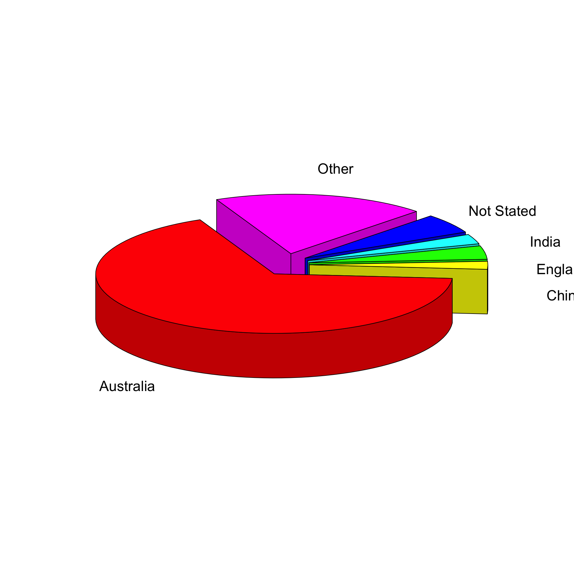
What about 2D pie charts?

Which category has the largest percentage?
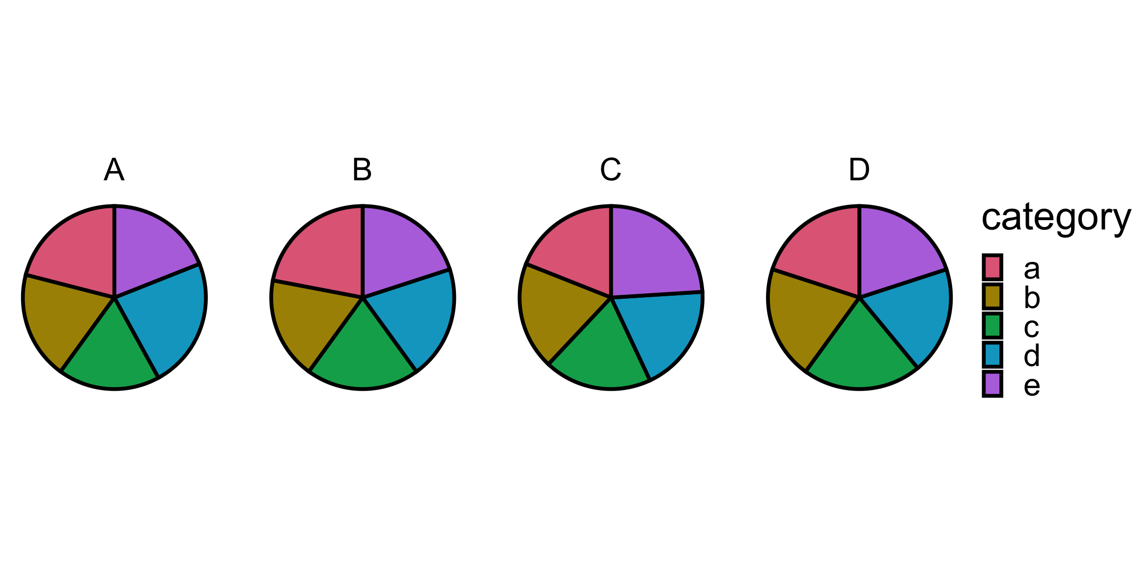
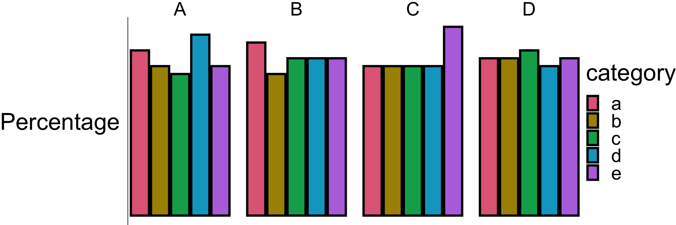
help("pie")

Pie charts are a very bad way of displaying information. The eye is good at judging linear measures and bad at judging relative areas. A bar chart or dot chart is a preferable way of displaying this type of data.

  • This comes from empirical research of Cleveland & McGill (1984) among others.

Elementary perceptual tasks

Non-exhaustive

Retrieving information from graphs

Of the 10 elementary perception tasks, Cleveland & McGill (1984) found the accuracy ranked as follows…

Rank 1

Example

Rank 2

Example

Rank 3

Example

Rank 4

Example

Rank 5

Example

Rank 6

Example

Preattentive processing

Viewers can notice certain features are absent or present without focussing their attention on particular regions.

  • Which plot helps you to distinguish the data points?


Gestalt principles

  • “Gestalt” is German for form or shape.
  • Gestalt principles are a set of laws to address the natural compulsion to find order in disorder by perceiving a series of individual elements as a whole.
  • Law of proximity: Elements that are close together are perceived as being related.
  • Law of similarity: Elements that share similar characteristics are perceived as belonging together.
  • Law of closure: Elements that are arranged in a way that suggests a complete form are perceived as a whole.

Case study Birth place from the 2021 Australian Census

Birth place Count %
Australia 17,020,422 66.9
Not Stated 1,358,658 5.3
England 927,490 3.6
Other 759,173 3.0
India 673,352 2.6
China 549,618 2.2
New Zealand 530,492 2.1
Philippines 293,892 1.2
Vietnam 257,997 1.0
South Africa 189,207 0.7
Malaysia 165,616 0.7
Italy 163,326 0.6
Sri Lanka 131,904 0.5
Nepal 122,506 0.5
Scotland 118,496 0.5
Korea South 102,092 0.4
United States America 101,309 0.4
Germany 101,255 0.4
Hong Kong 100,148 0.4
Iraq 92,922 0.4
Greece 92,314 0.4
Pakistan 89,633 0.4
Lebanon 87,340 0.3
Indonesia 87,075 0.3
Thailand 83,779 0.3
Ireland 80,927 0.3
Iran 70,899 0.3
Fiji 68,947 0.3
Netherlands 66,481 0.3
Singapore 61,056 0.2
Afghanistan 59,797 0.2
Bangladesh 51,491 0.2
Canada 50,223 0.2
Taiwan 49,511 0.2
Brazil 46,720 0.2
Poland 45,884 0.2
Japan 45,267 0.2
Croatia 43,302 0.2
Egypt 43,213 0.2
North Macedonia 41,786 0.2
Zimbabwe 39,714 0.2
Myanmar 39,171 0.2
Cambodia 39,043 0.2
Turkey 38,568 0.2
France 36,019 0.1
Malta 35,413 0.1
Papua New Guinea 29,984 0.1
Chile 29,860 0.1
Wales 29,250 0.1
Samoa 28,107 0.1
Bosnia Herzegov 26,171 0.1
Mauritius 25,981 0.1

Plot #1

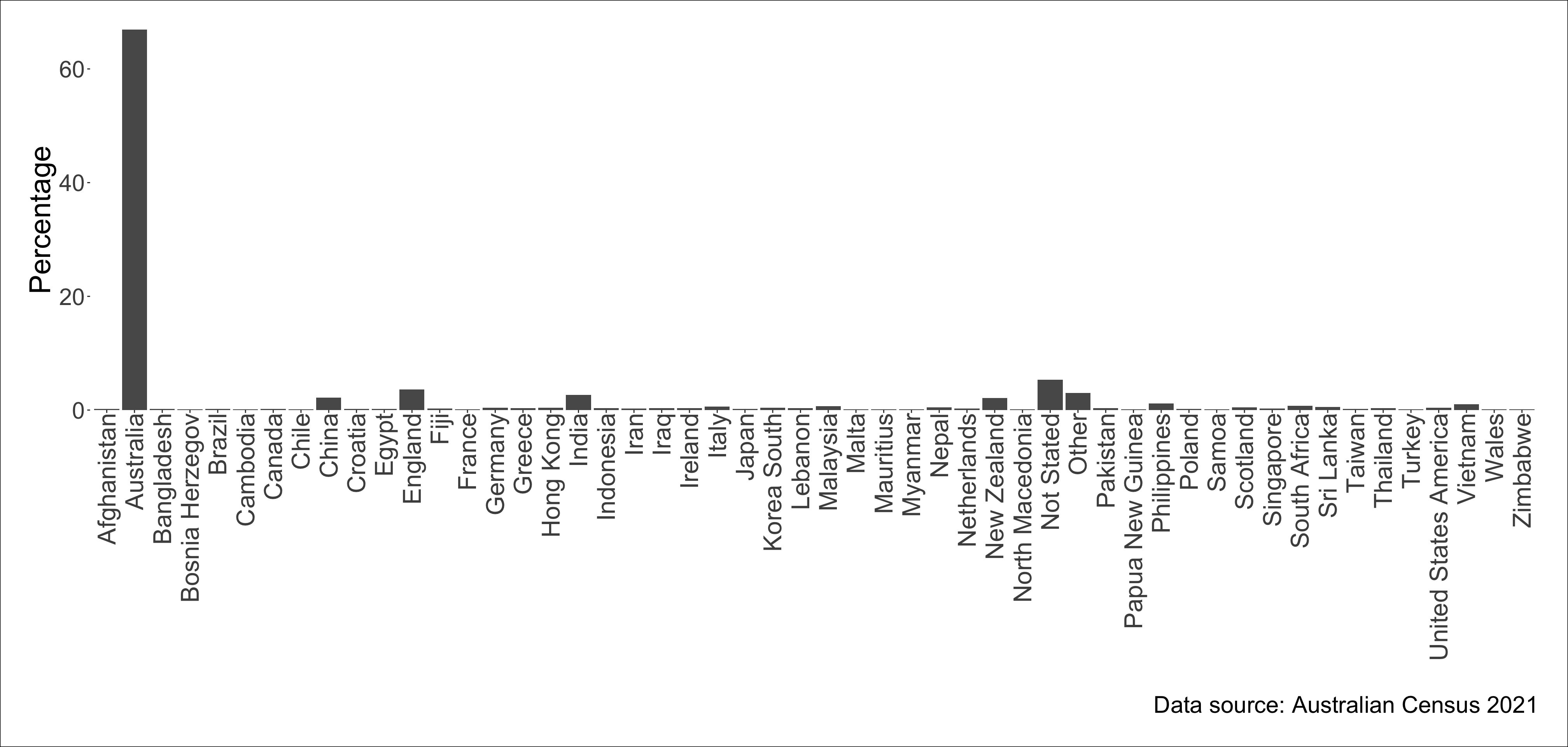
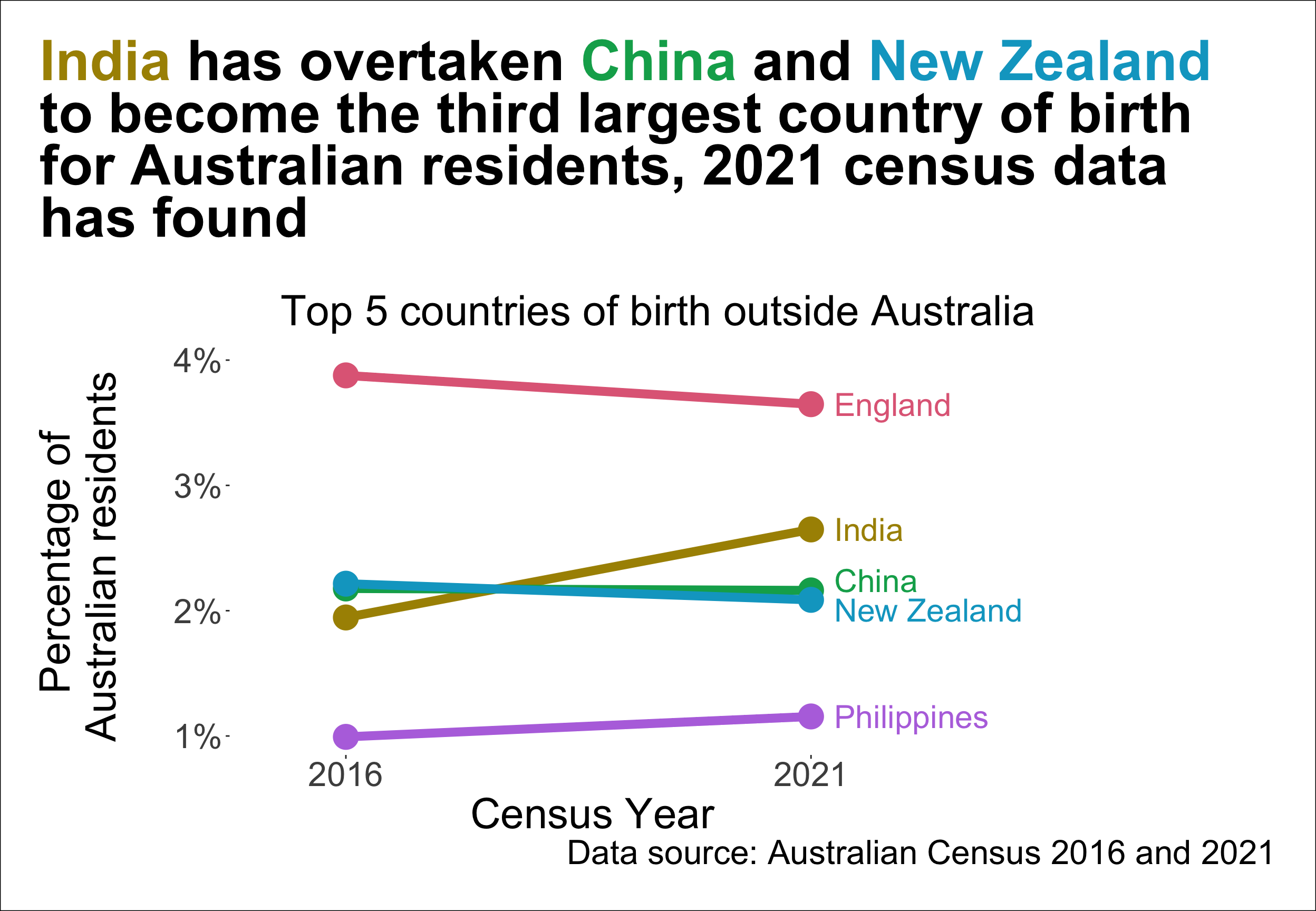
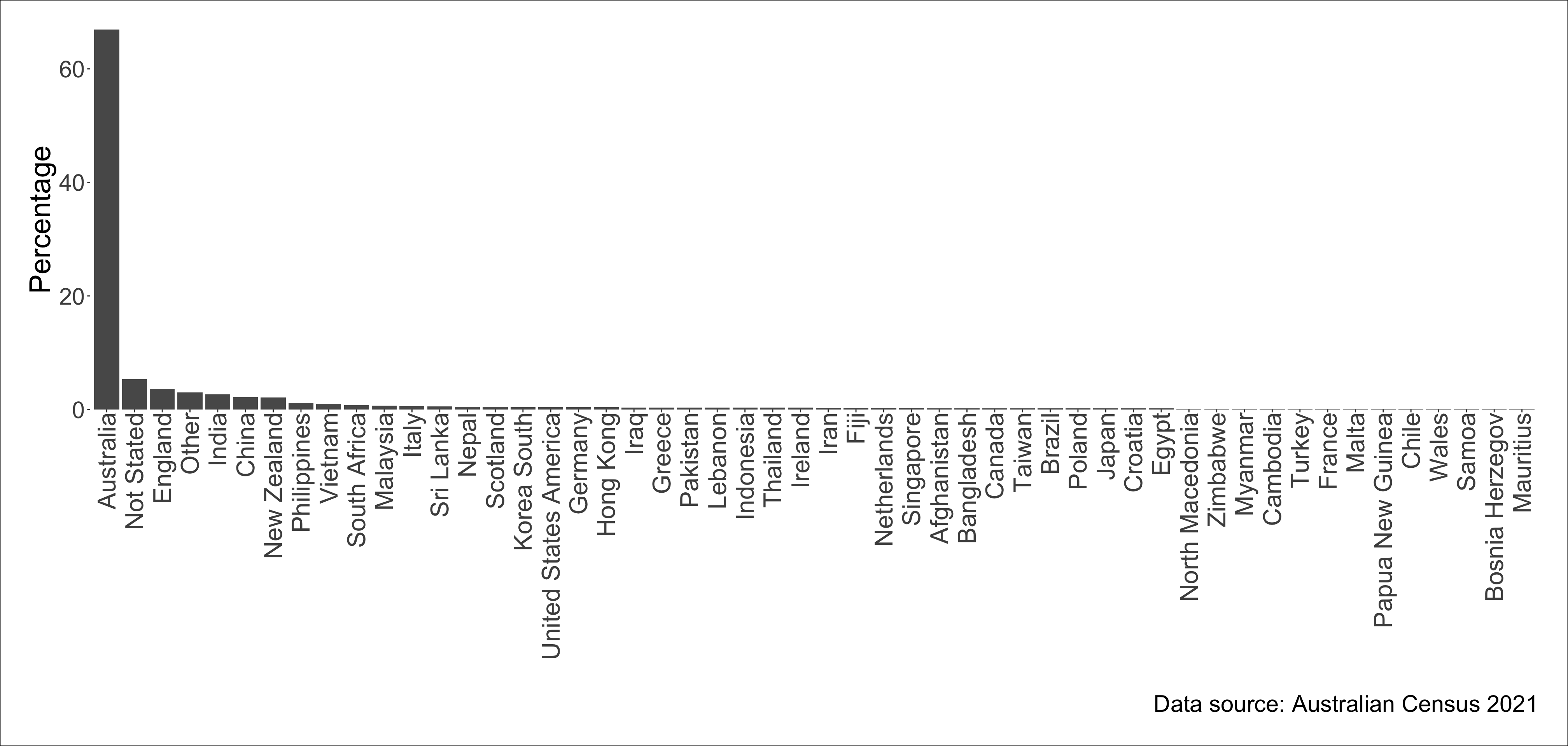
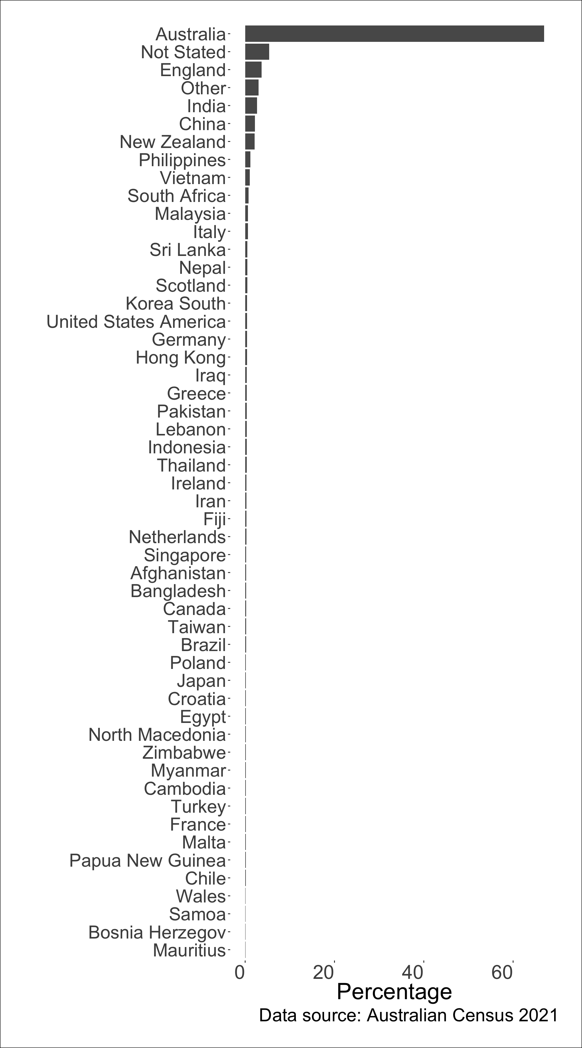
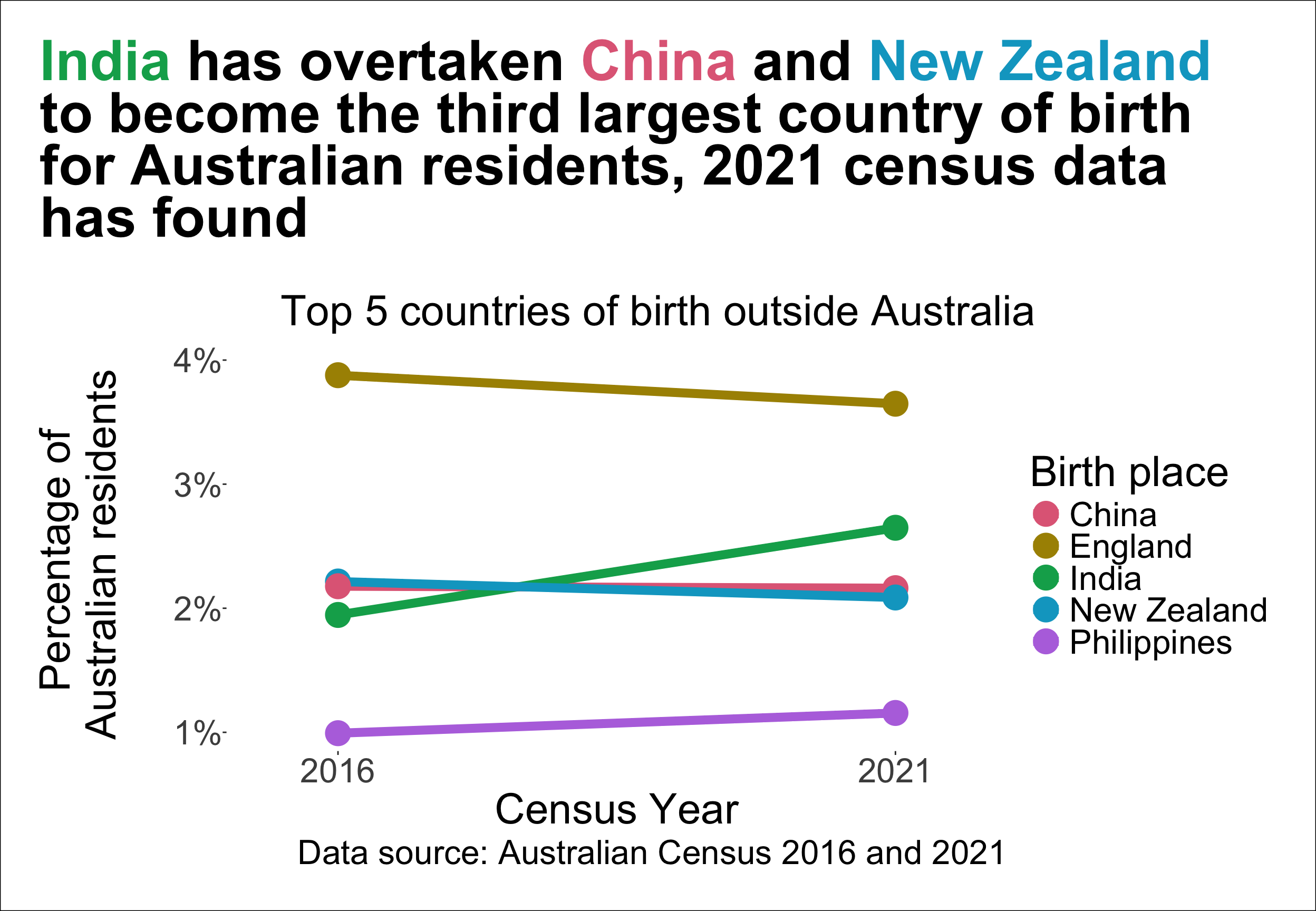
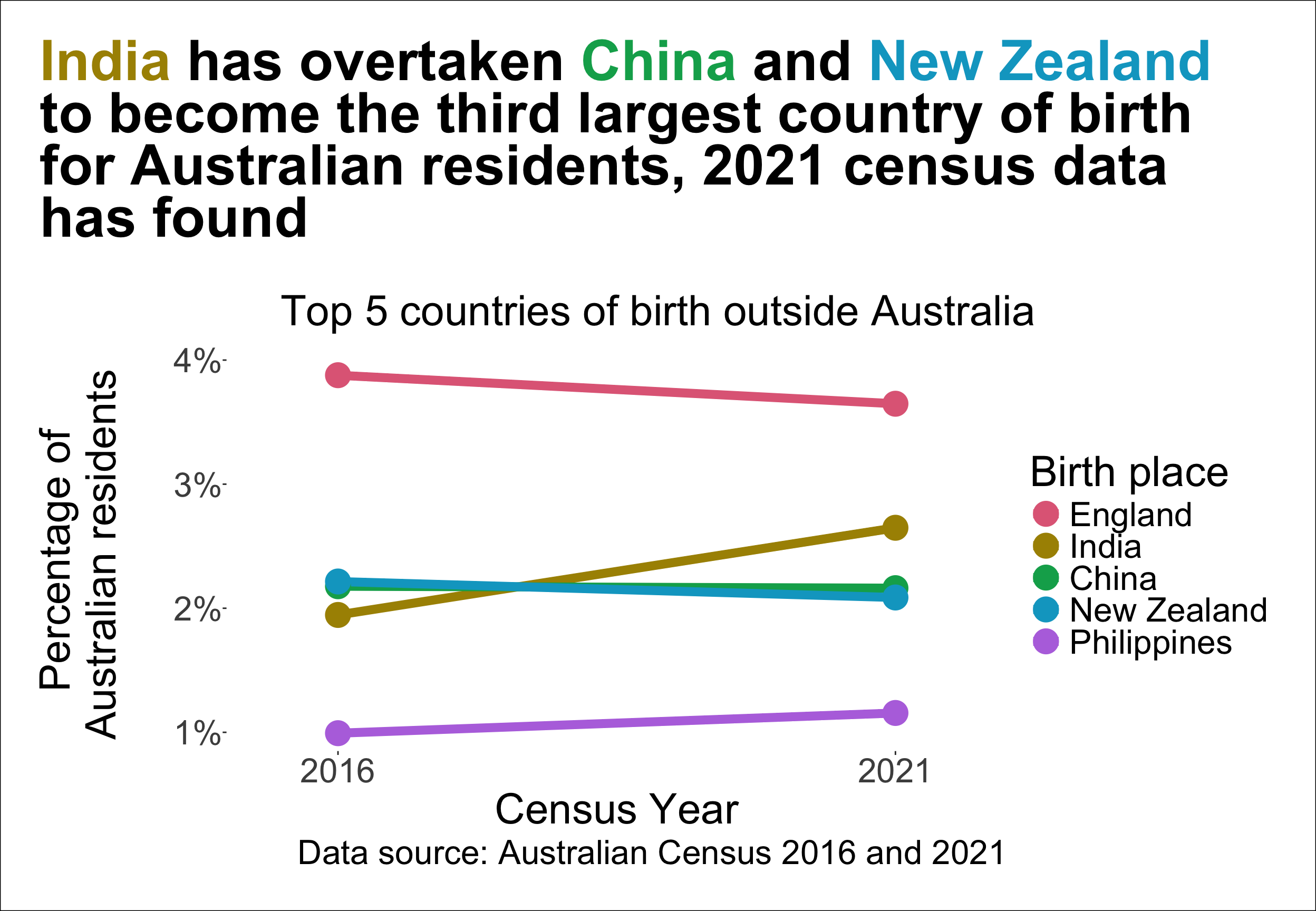
Which birth place is the third largest among people in Australia?

Plot #2

Can you read the labels without tilting your head?

Plot #3


What’s the data story?

Plot #4


  • The text on the bar shows the percentage out of 25,422,788 Australian residents born in the corresponding country.

  • There were 5.3% of Australian residents who did not state their birth place.

  • The top country of birth place is Australia with 66.9% of Australian residents born in Australia.

Story from The Guardian.
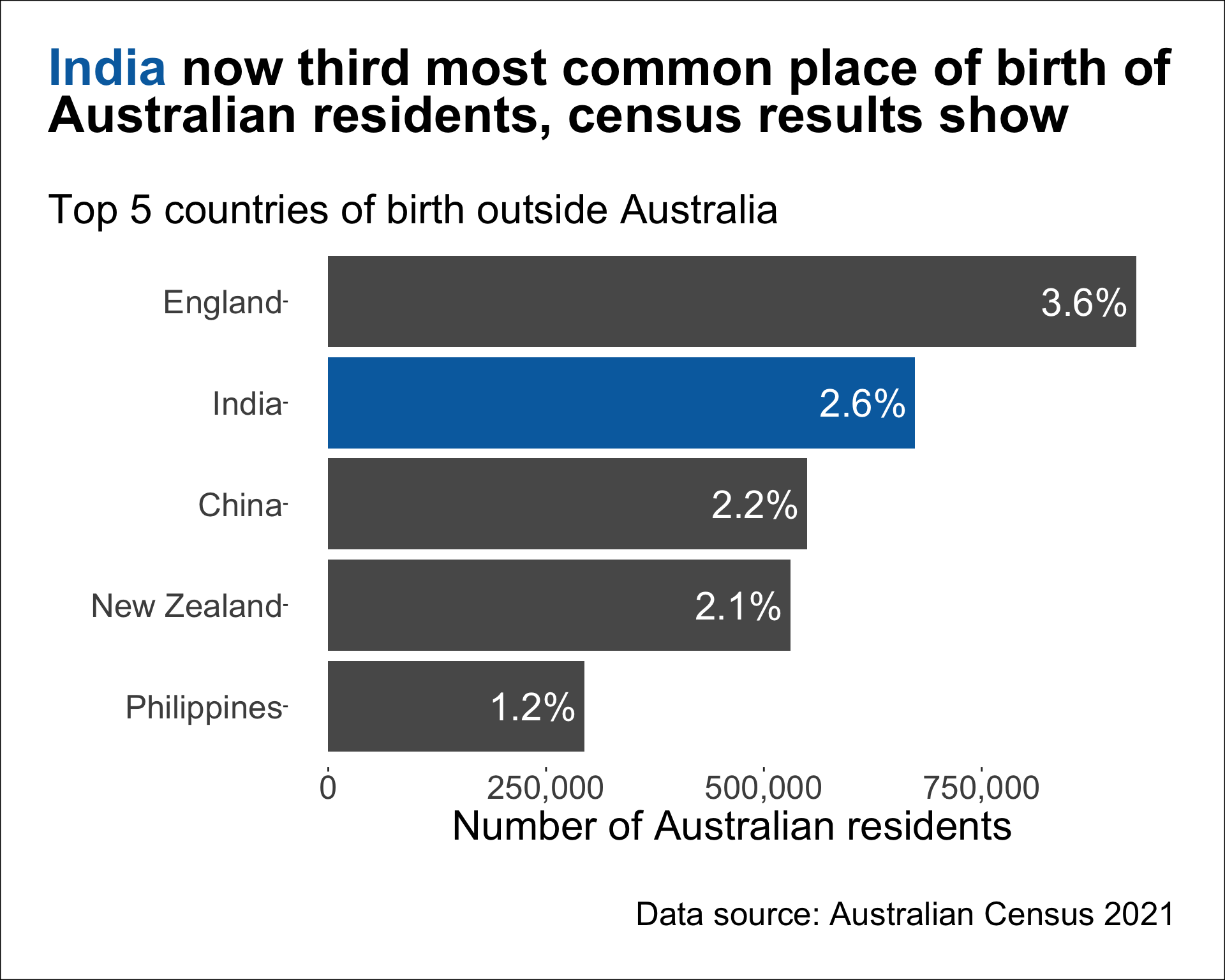
Another data story

Data Story

India has overtaken China and New Zealand to become the third largest country of birth for Australian residents, 2021 census data has found.

– The Guardian

Birth place Count % Census Year
England 907,570 3.9 2016
New Zealand 518,466 2.2 2016
China 509,555 2.2 2016
India 455,389 1.9 2016
Philippines 232,386 1.0 2016
England 927,490 3.6 2021
India 673,352 2.6 2021
China 549,618 2.2 2021
New Zealand 530,492 2.1 2021
Philippines 293,892 1.2 2021

Plot #5

Does this show that India overtook China and New Zealand?
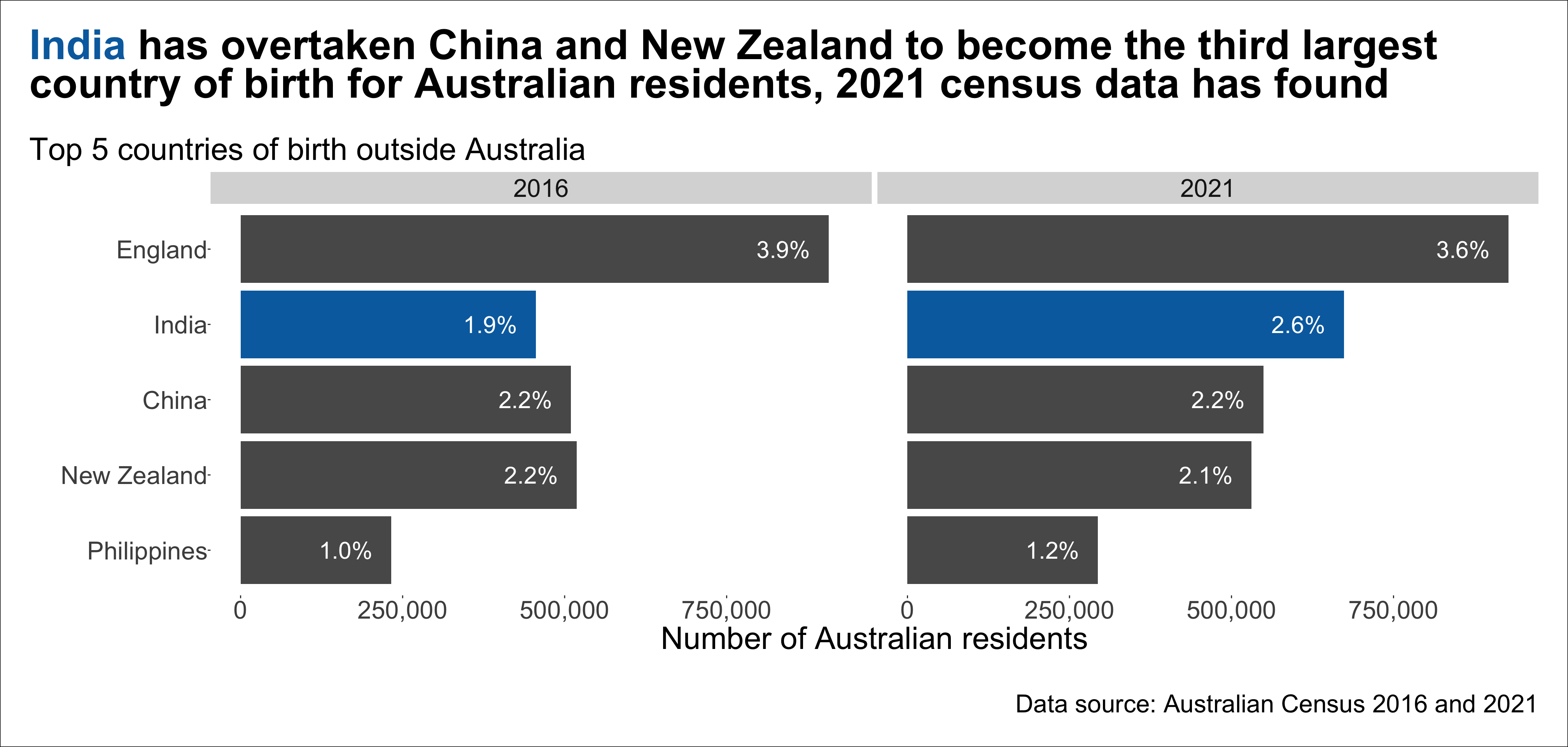
Plot #6

Should we show percentage instead of counts?
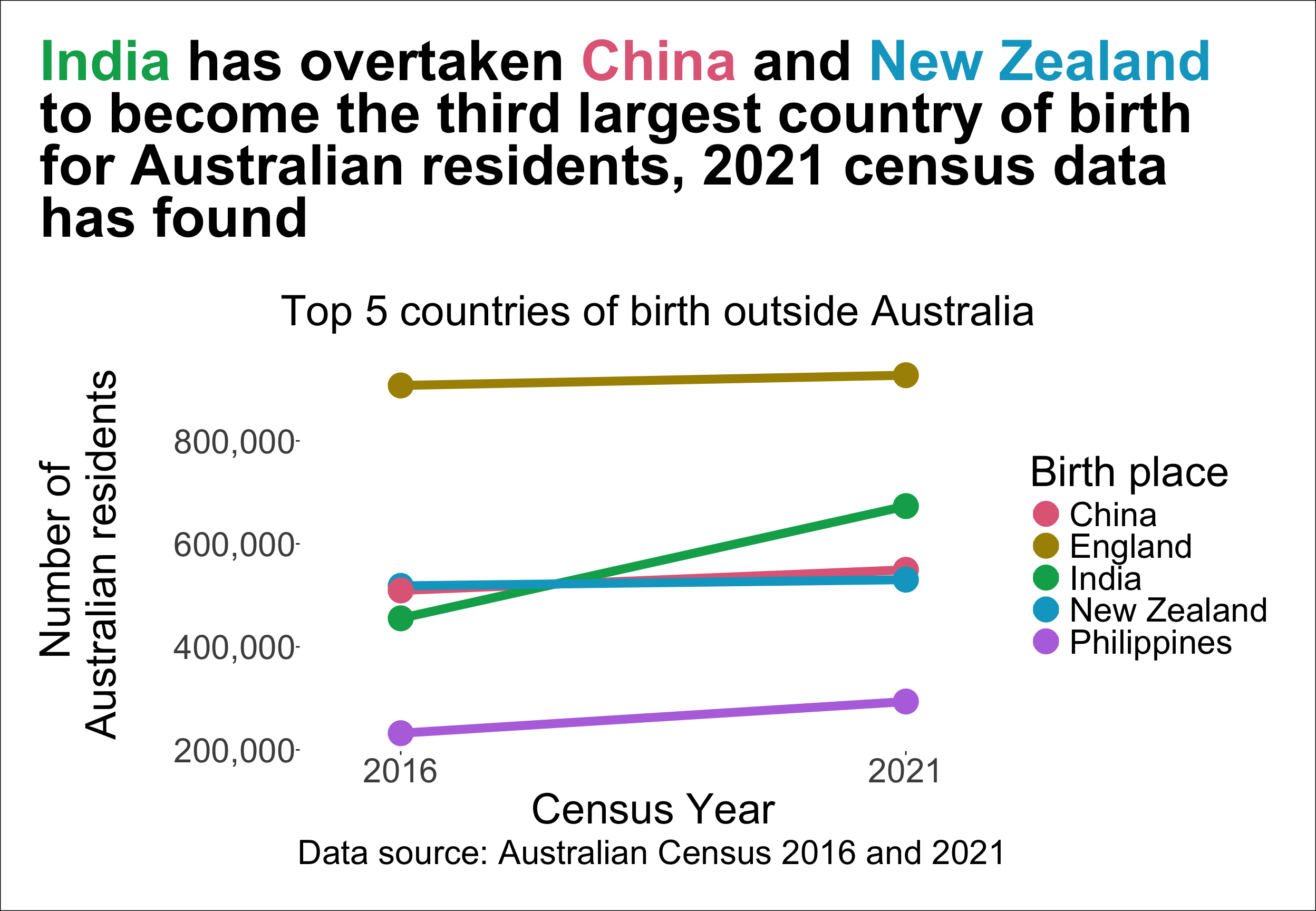
Plot #7

The legend and the line order is different…

Plot #8

Maybe we can put the labels directly in the plot?

Plot #9

Color palettes

Qualitative palettes

  • Designed for nominal variable (no particular ordering)

Sequential palettes

  • Designed for ordered categorical variable or number going from low to high (or vice-versa)

Diverging palettes

  • Designed for ordered categorical variable or number going from low to high (or vice-versa) with a neutral value in between

Colorblindness

Colorblindness affect roughly 1 in 8 men.

Using different color palettes in ggplot2

  • To change the color scale, you can use functions starting from
    • scale_color_ (for points, lines, etc.) or
    • scale_fill_ (for bars, areas, etc.) in ggplot2.

Summary

  • Data visualisation can make large, complex data more accessible, understandable and usable.
  • An effective data visualisation means to design your data plot to effectively use human visual system to improve cognition about a targeted information from the data.
  • Empirical research has found that the accuracy of retrieving information from graphs is ranked as follows: position on common scale > position on non-aligned scale > length > direction > angle > area > volume > curvature > color shade/saturation > color hue.
  • Preattentive processing allows viewers to notice certain features are absent or present without focussing their attention on particular regions.
  • Gestalt principles are a set of laws to address the natural compulsion to find order in disorder by perceiving a series of individual elements as a whole.
  • Choosing the right plot type and design can help to effectively communicate the data story.
  • There are three types of color palettes: qualitative (for nominal variable), sequential (for ordered variable), and diverging (for ordered variable with a neutral value in between).
  • When choosing colors for data visualisation, it is important to consider colorblindness.