Data Visualisation with R
STAT1003 – Statistical Techniques
Australian National University
These slides are best viewed on a modern browser like Google Chrome on a desktop or laptop. Some interactive components may require some time to fully load.
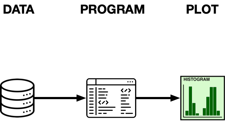
How do we plot?
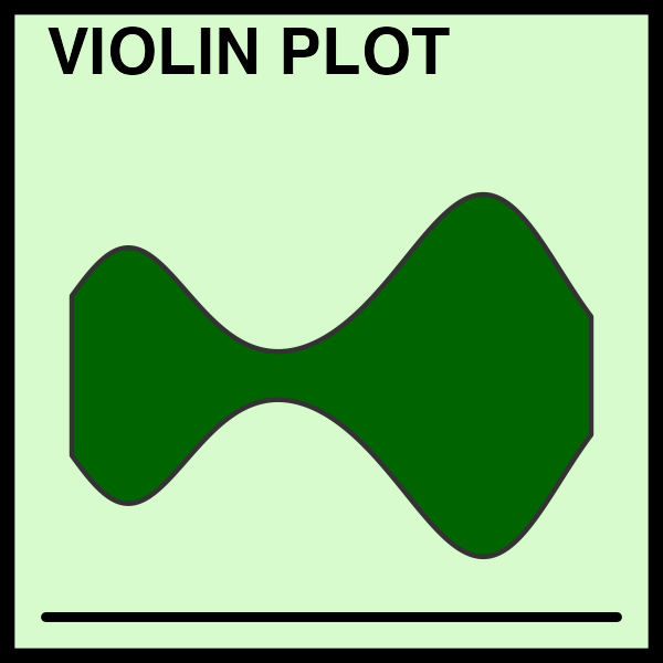
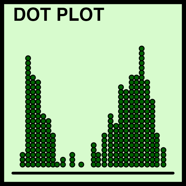
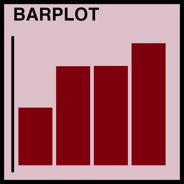
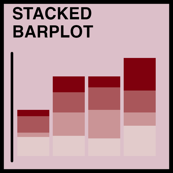
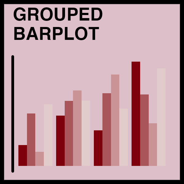
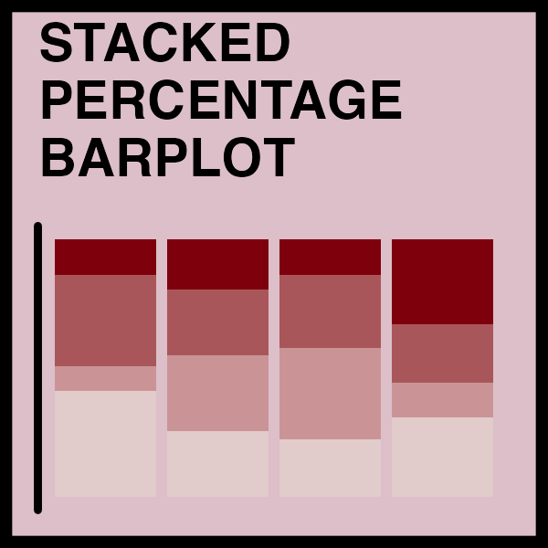
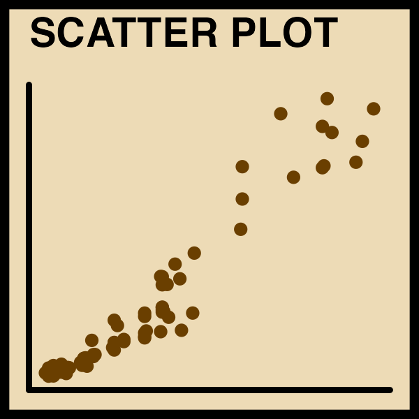
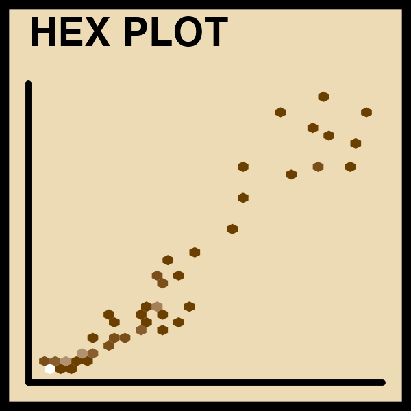
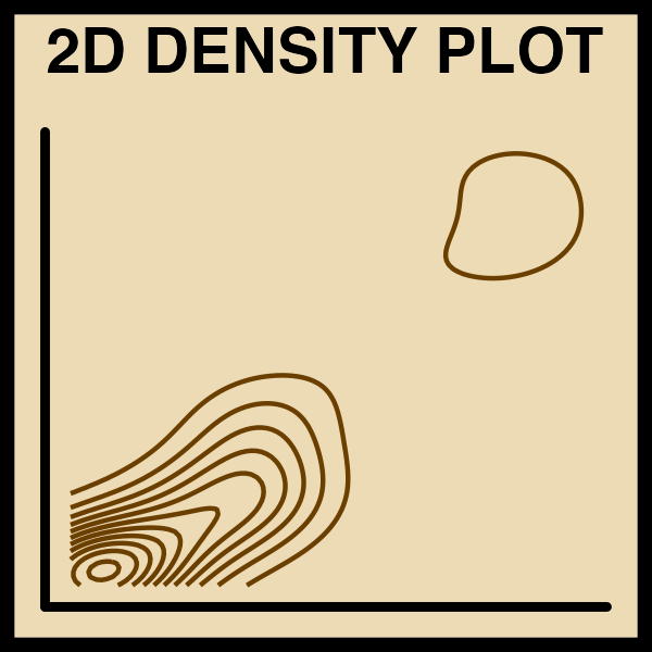
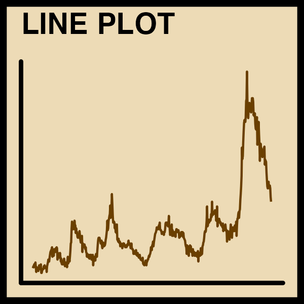
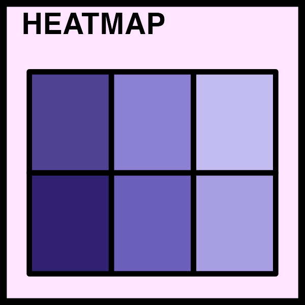
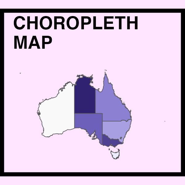
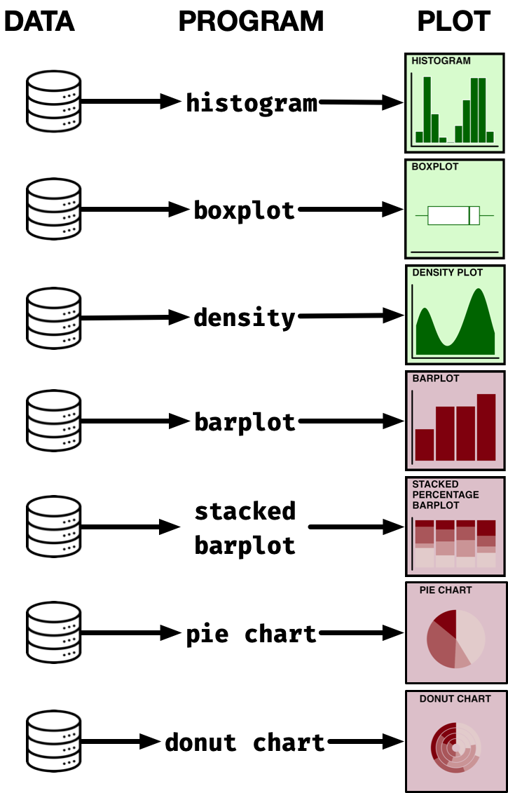
Catalogue of plot types (not exhaustive)
How do we plot it all?
Summary of R graphics

ggplot2 R package
ggplot2R package is part of thetidyversesuite of R packagesggplot2is widely used by the scientific community and even by news outlets (e.g. Financial Times and BBC)
Basic structure of ggplot
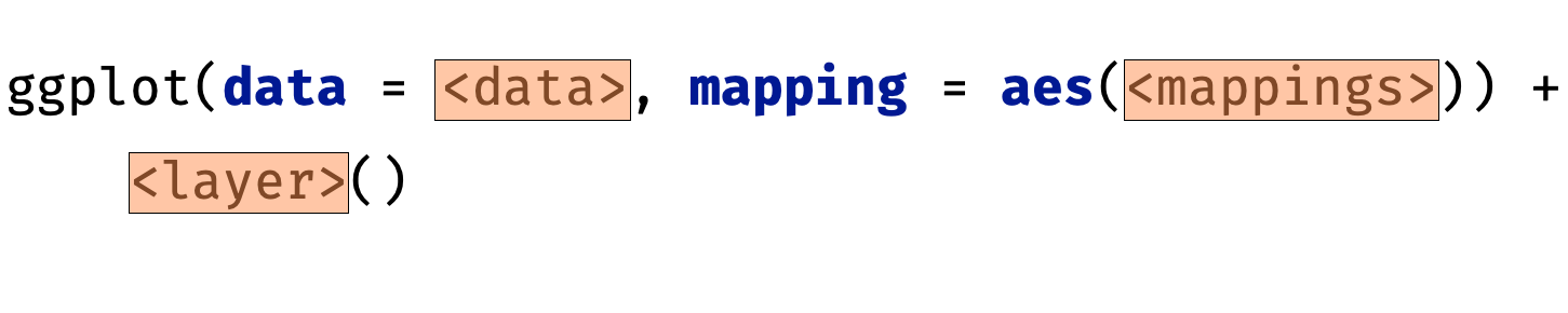
- data as
data.frame - a set of aesthetic mappings between variables in the data and visual properties
- at least one layer which describes what to render
- the coordinate system (explained later)
Visualising distributions


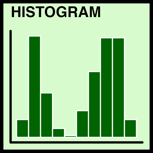
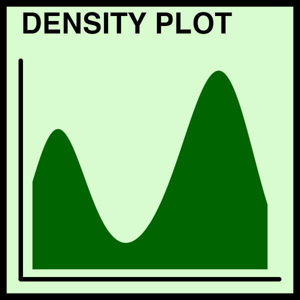
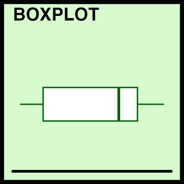
geom_histogram()geom_density()stat_ecdf()stat_qq()geom_boxplot()geom_violin()geom_jitter()
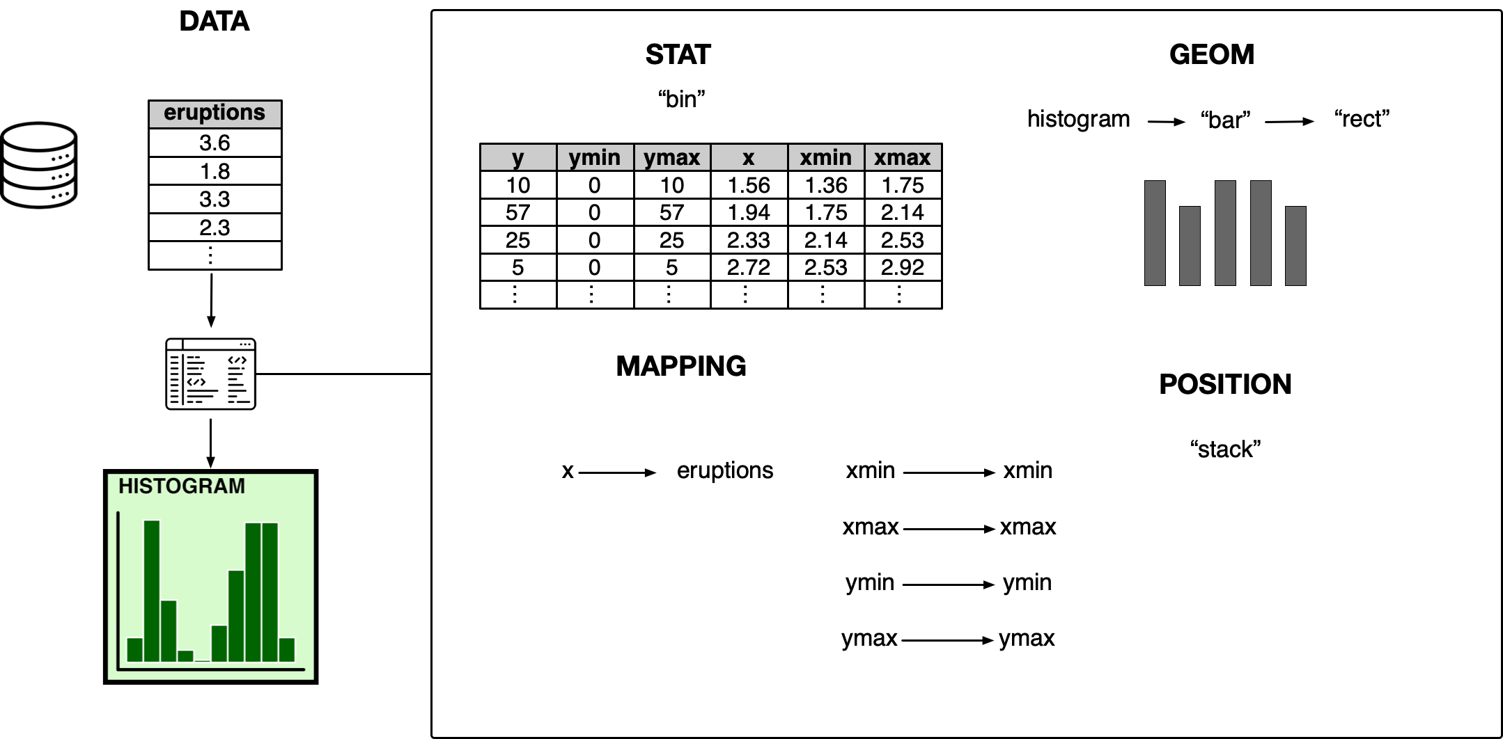
Deconstructing histogram
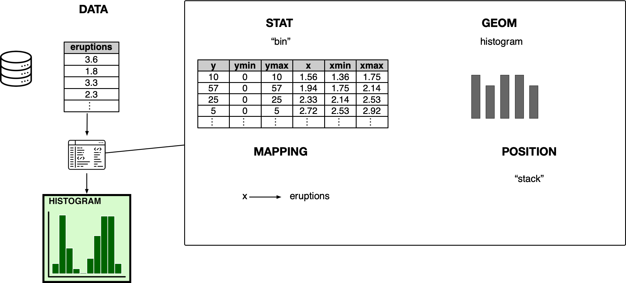
Deconstructing histogram
Visualising multivariate relationships


geom_point()geom_smooth()geom_bin2d()geom_hex()geom_line()
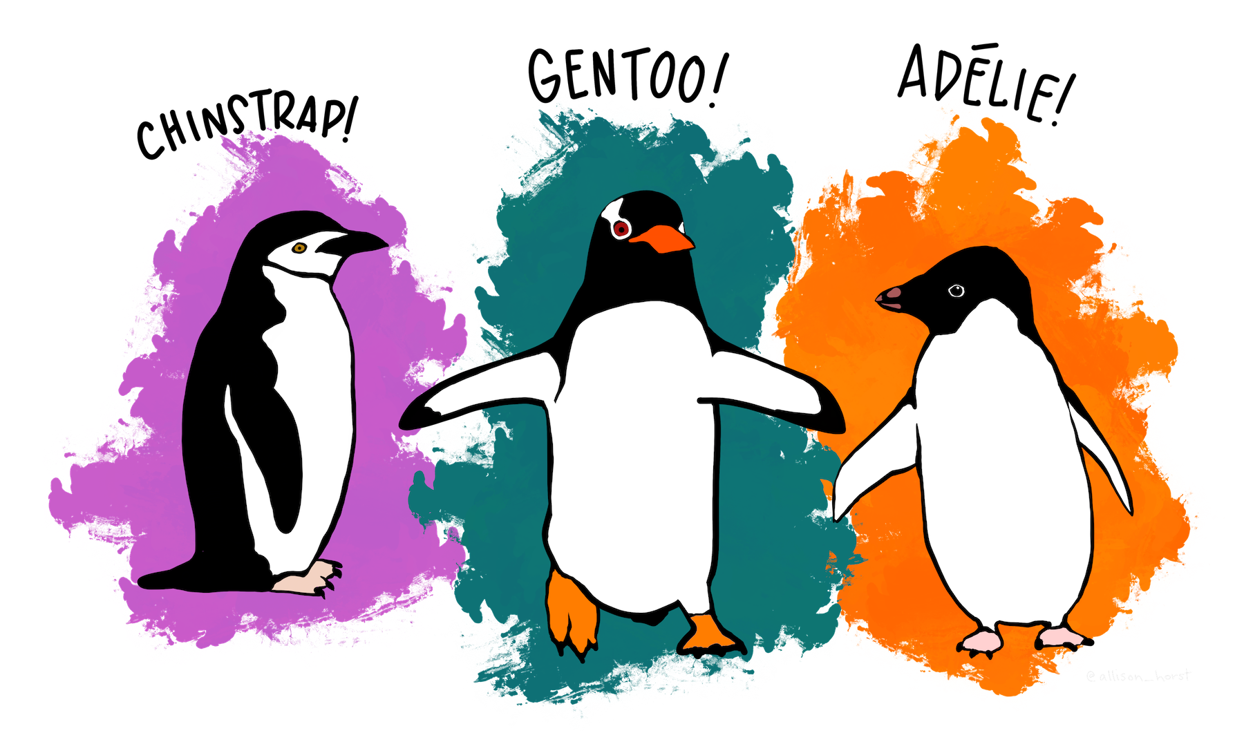
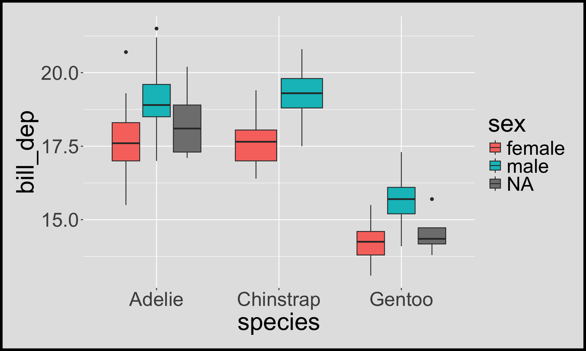
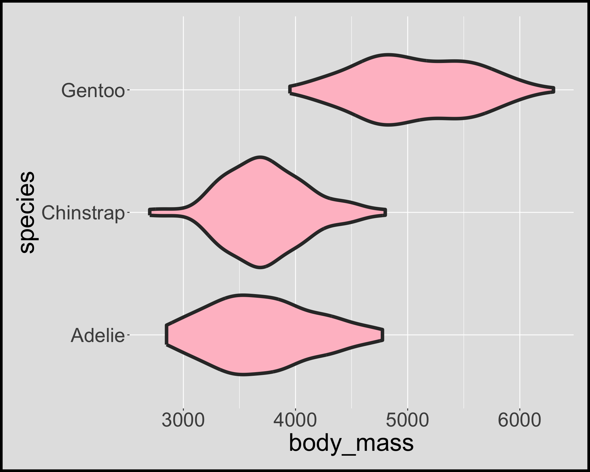
Case study  Palmer penguins
Mapping aesthetics to data
vignette("ggplot2-specs")
- Aesthetic arguments for each layer are found in documentation (e.g.
?geom_point).
Common aesthetics include:
x and y

alpha

color

fill

size

Example: a scatterplot with geom_point()
Make the following target plot:
- Notice that legends are automatically made for aesthetics
Aesthetic specification for points
shape

stroke vs size

- The default shape is “circle”.
strokeandfillis only for the “filled” shapes.
Aesthetic specifications for lines
color

linetype

linewidth

lineend

linejoin

When your input is an attribute
Don’t put attributes inside aes()!
Make this target plot:
Summary
- data as
data.frame - a set of aesthetic mappings between variables in the data and visual properties
- at least one layer (usually
geom_orstat_functions) which describes what to render - the coordinate system (explained later)
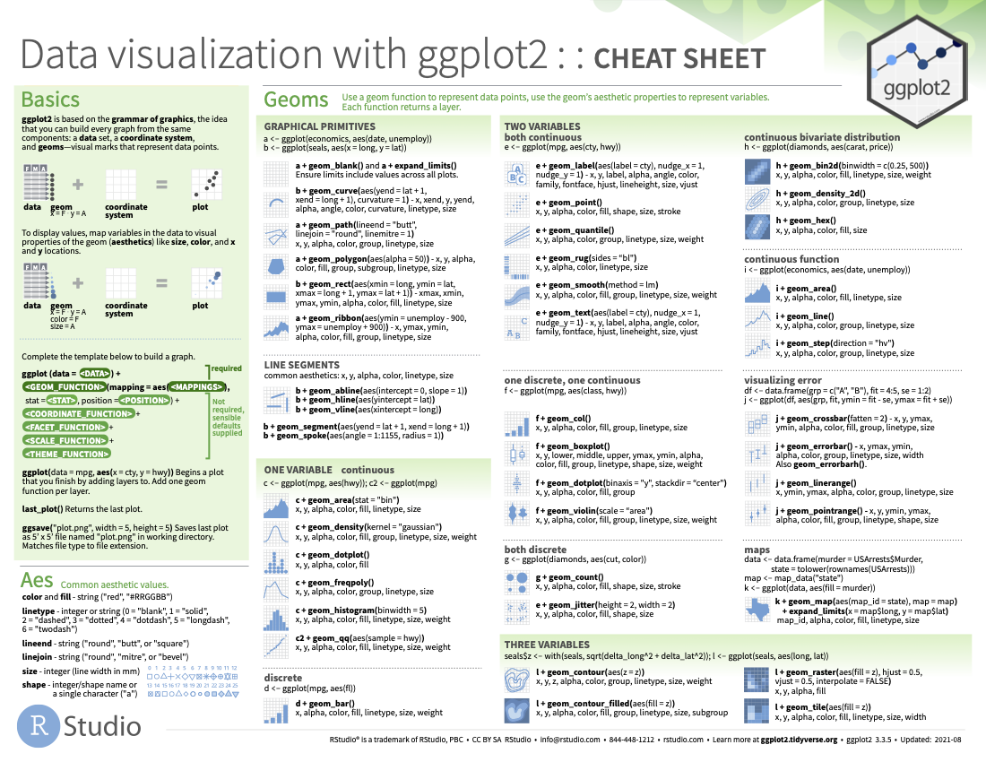
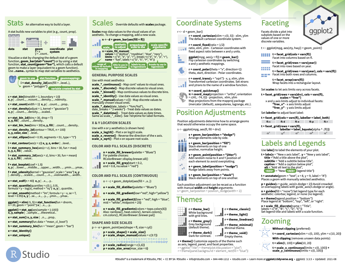
ggplot2 cheatsheet
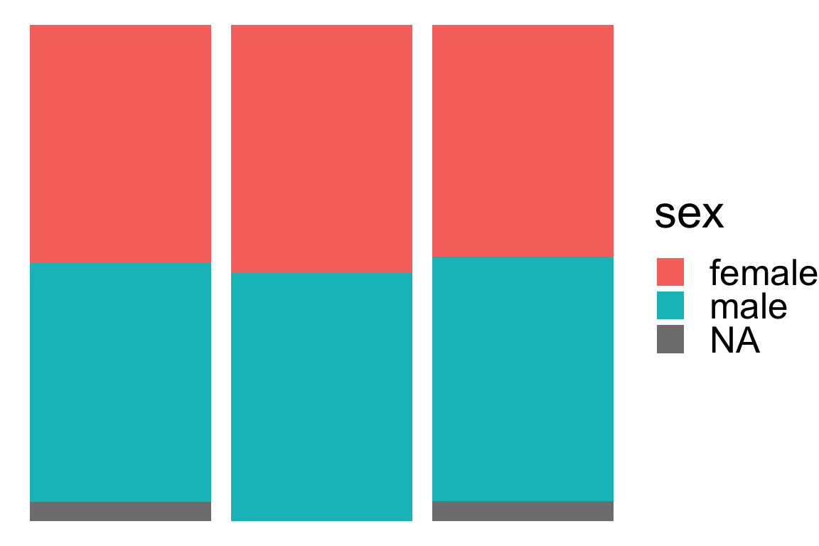
Visualising amounts and proportions


geom_bar()geom_col()geom_point()geom_tile()geom_density()
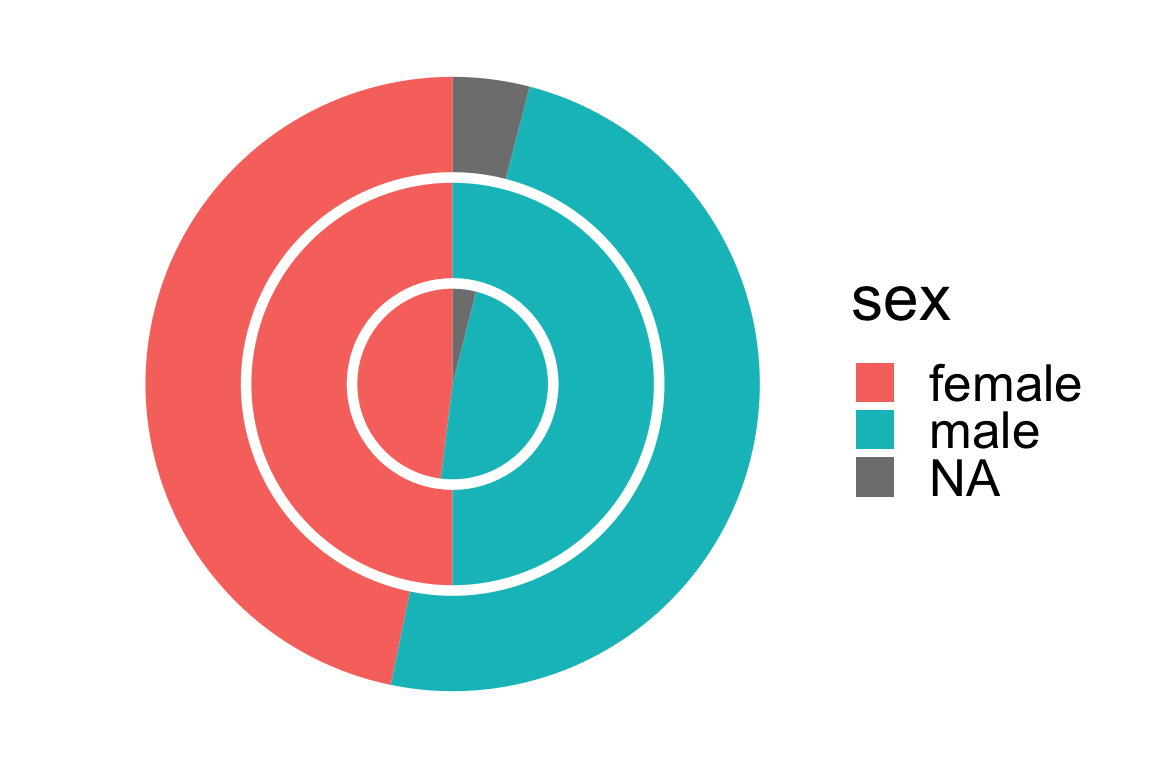
Pie or donut charts with coord_polar()
- The default coordinate system is the Cartesian coordinate system.
- But you can change this to a polar coordinate system like below.
Layering plots
- You can add more than one layer.
- The order of layer matters.
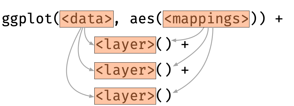
- A layer inherits the data and mapping from the initialised ggplot object by default
Layer-specific data and aesthetic mapping
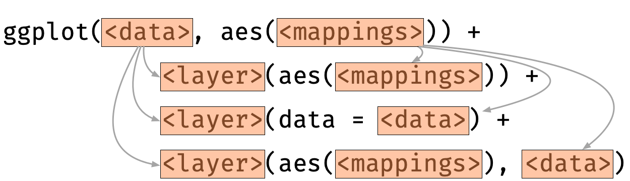
- For each layer, aesthetic and/or data can be overwritten.
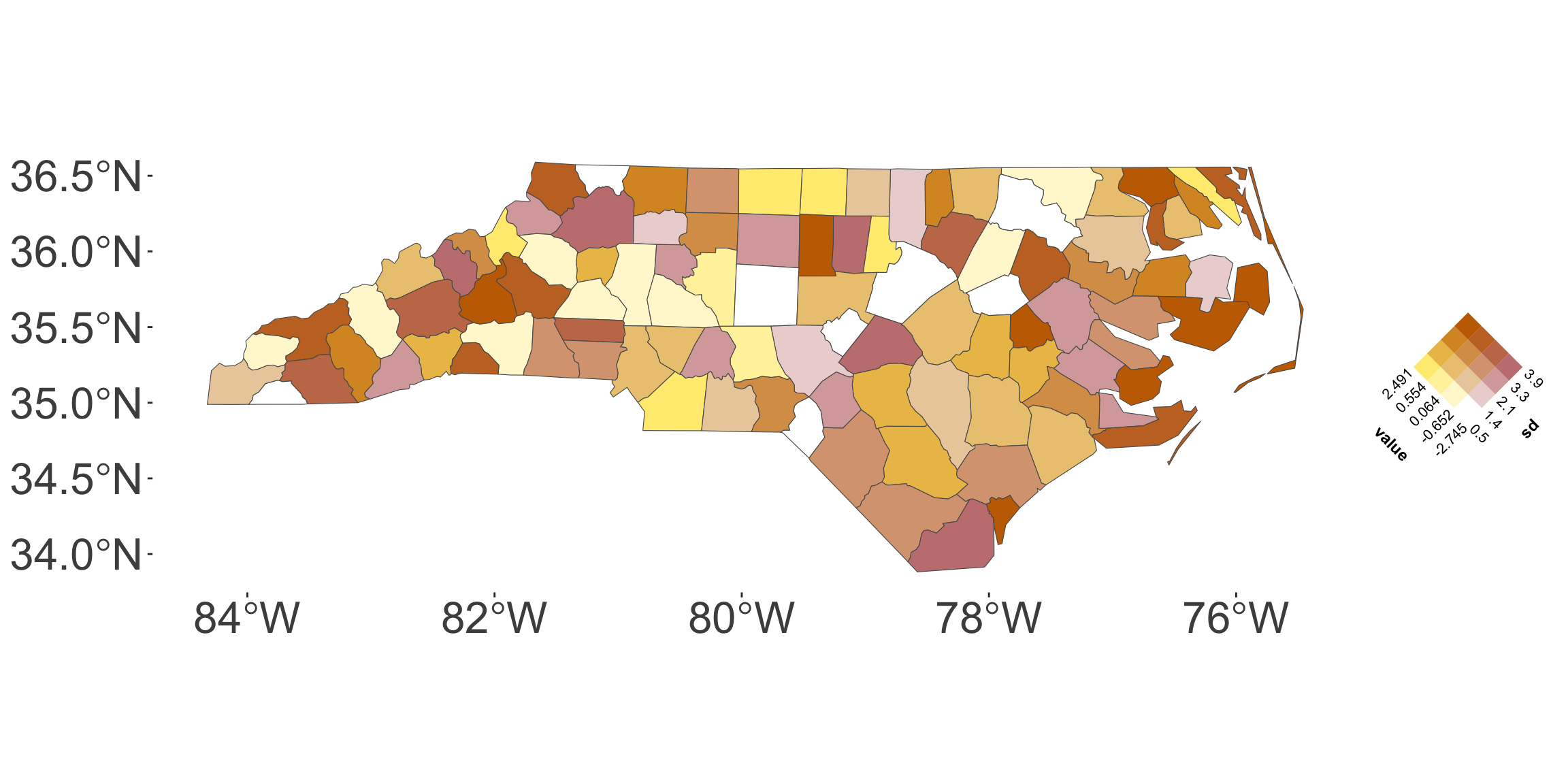
Featuring: ggincerta
- Your tutor, Maggie Ma, developed an extension package
ggincertato visualise uncertainty inggplot2as part of her PhD work!
Summary
- You can construct plots with multiple layers in
ggplot2. - The order of the layer matters.
- A layer inherits the data and mapping from the initialised ggplot object by default
- But the data and mappings for each layer can be overwritten.
- There are many more features and extensions of
ggplot2to explore!