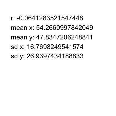
Summary statistics for bivariate data
STAT1003 – Statistical Techniques
Australian National University
These slides are best viewed on a modern browser like Google Chrome on a desktop or laptop. Some interactive components may require some time to fully load.
Wrong interpretation of correlation coefficient
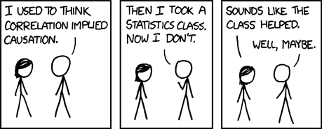
Source: xkcd
Just because \(x\) and \(y\) are highly correlated, it does not mean that \(x\) causes \(y\) or vice versa – correlation is not causation!
- Number of ice cream sales and the rate of drowning deaths.
- It is also easy to get spurious correlation if computing many pairwise correlations.
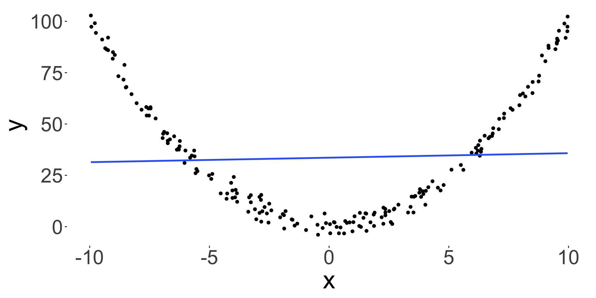
- Correlation also only measures a linear relationship, so low correlation doesn’t mean that there is no relationship.
\[r = 0.1052124\]
Summary statistics can be misleading
- You can have a bivariate dataset with the exact same:
- marginal mean,
- marginal variance and
- correlation, but the relationship between the two variables can be very different.
- Always plot your data!