Summary statistics for univariate data
STAT1003 – Statistical Techniques
Australian National University
These slides are best viewed on a modern browser like Google Chrome on a desktop or laptop. Some interactive components may require some time to fully load.
Nominal vs. Ordinal variables
- We can use exactly the same statistics for ordinal data we used for nominal data, e.g., frequency tables, bar charts, pie charts, etc.
- For ordinal data, preserve the order of the categories.
- For nominal data, reorder the categories based on another variable (if appropriate).
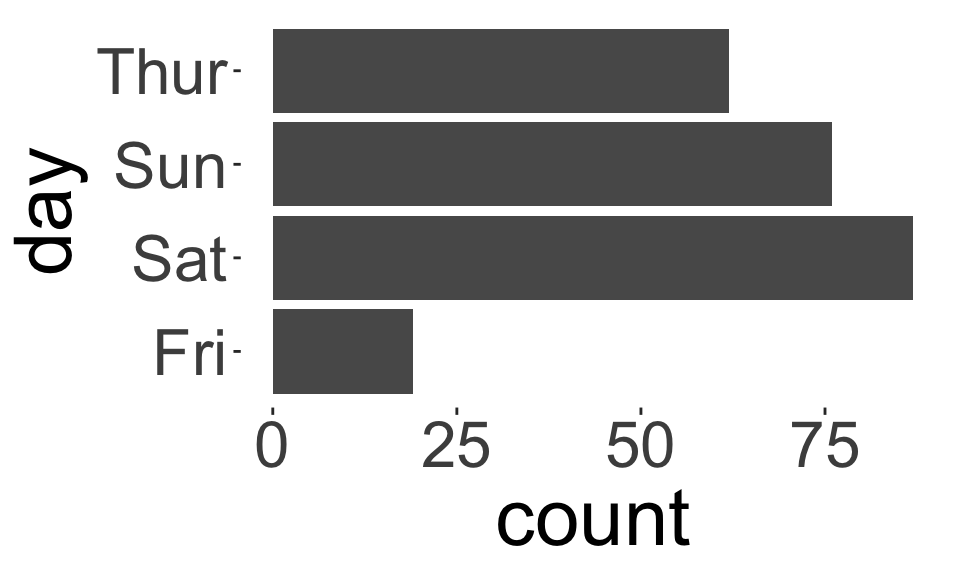
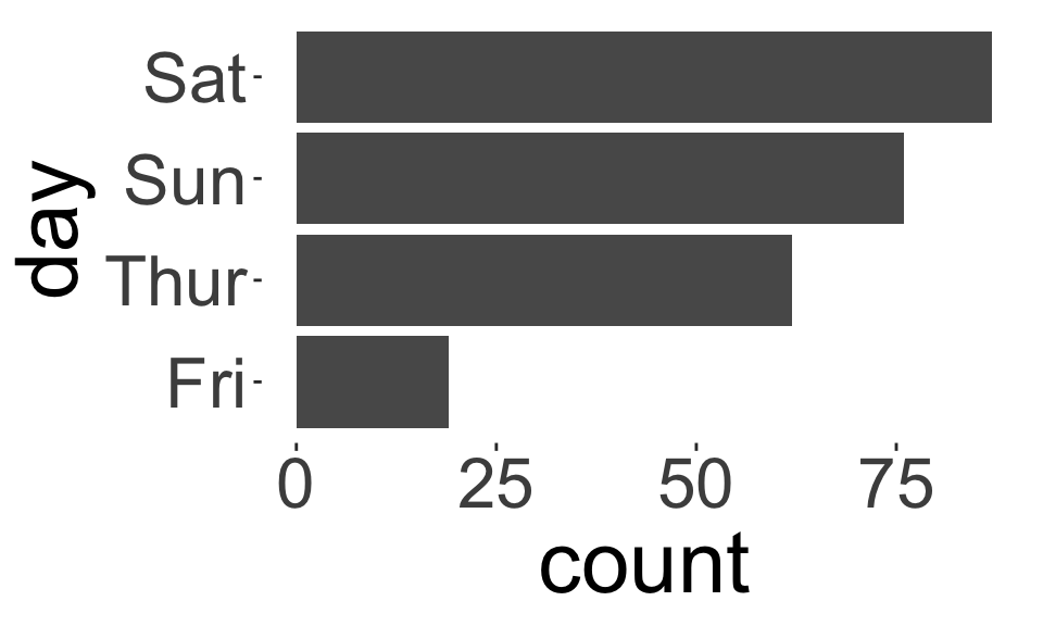
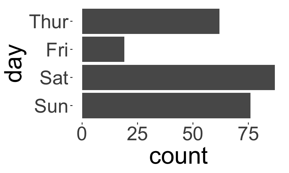
How do these plots differ?
A measure of central tendency
A measure of central tendency is a location of the “middle”, “center”, or “expected value” of the distribution of your data.

Sample mean (or average) and median are examples of measures of central tendency
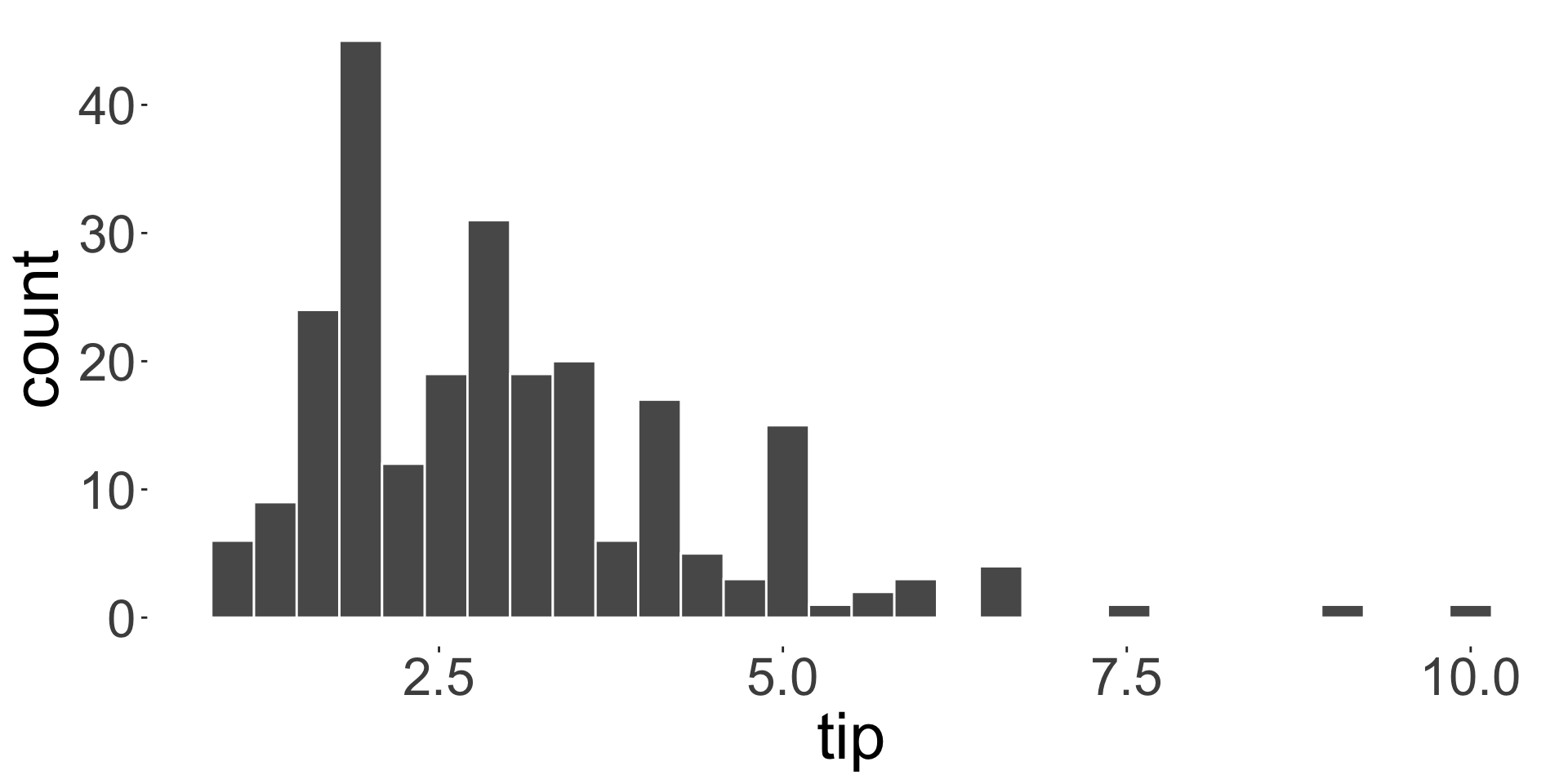
What is the average customer tip?
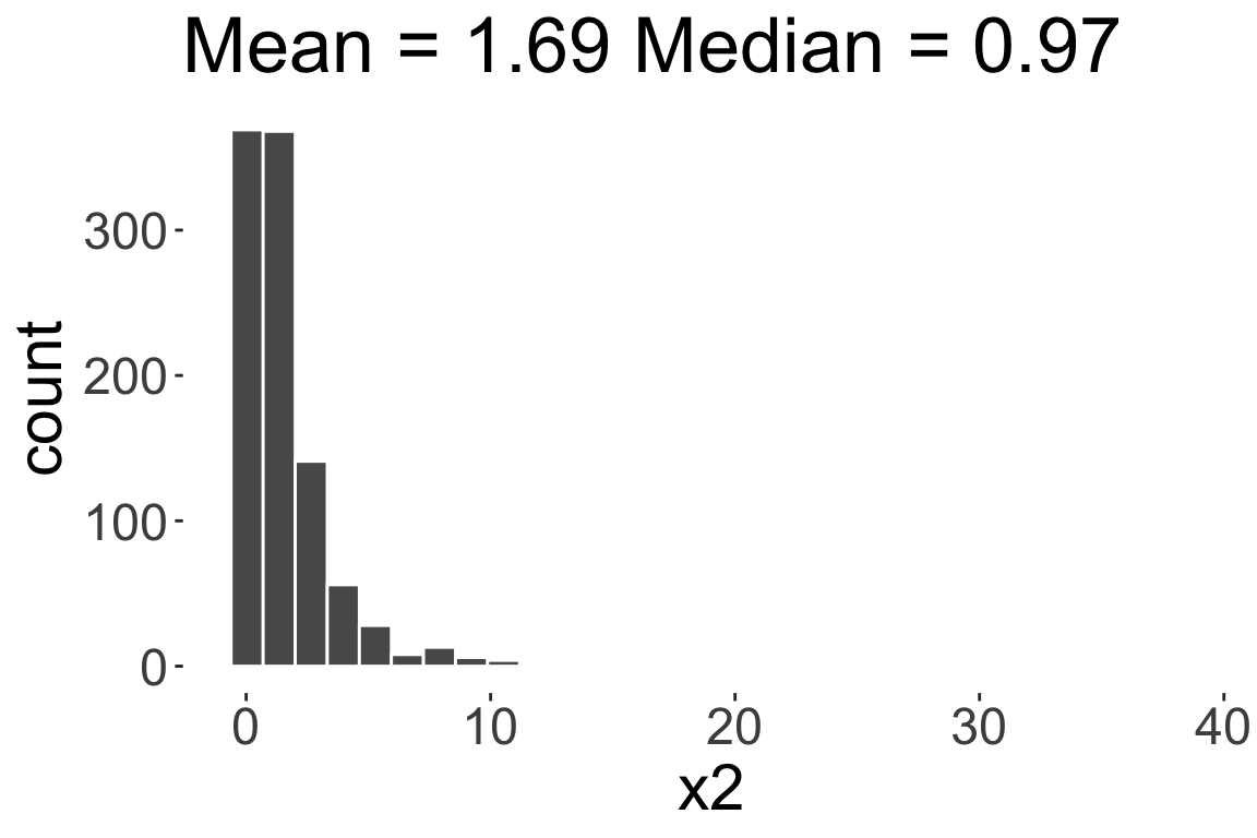
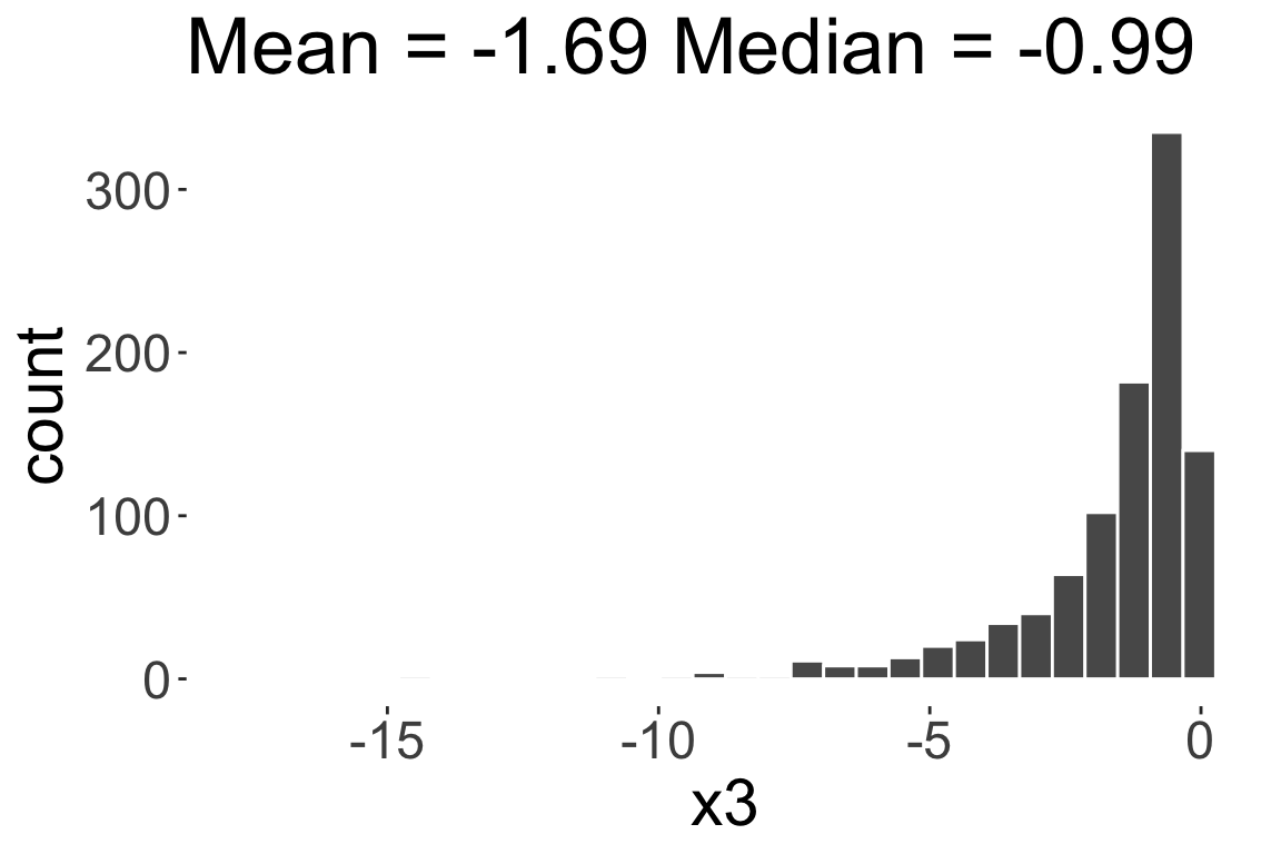
Skewness
- Skewness is a measure of asymmetry in a given distribution
Symmetric
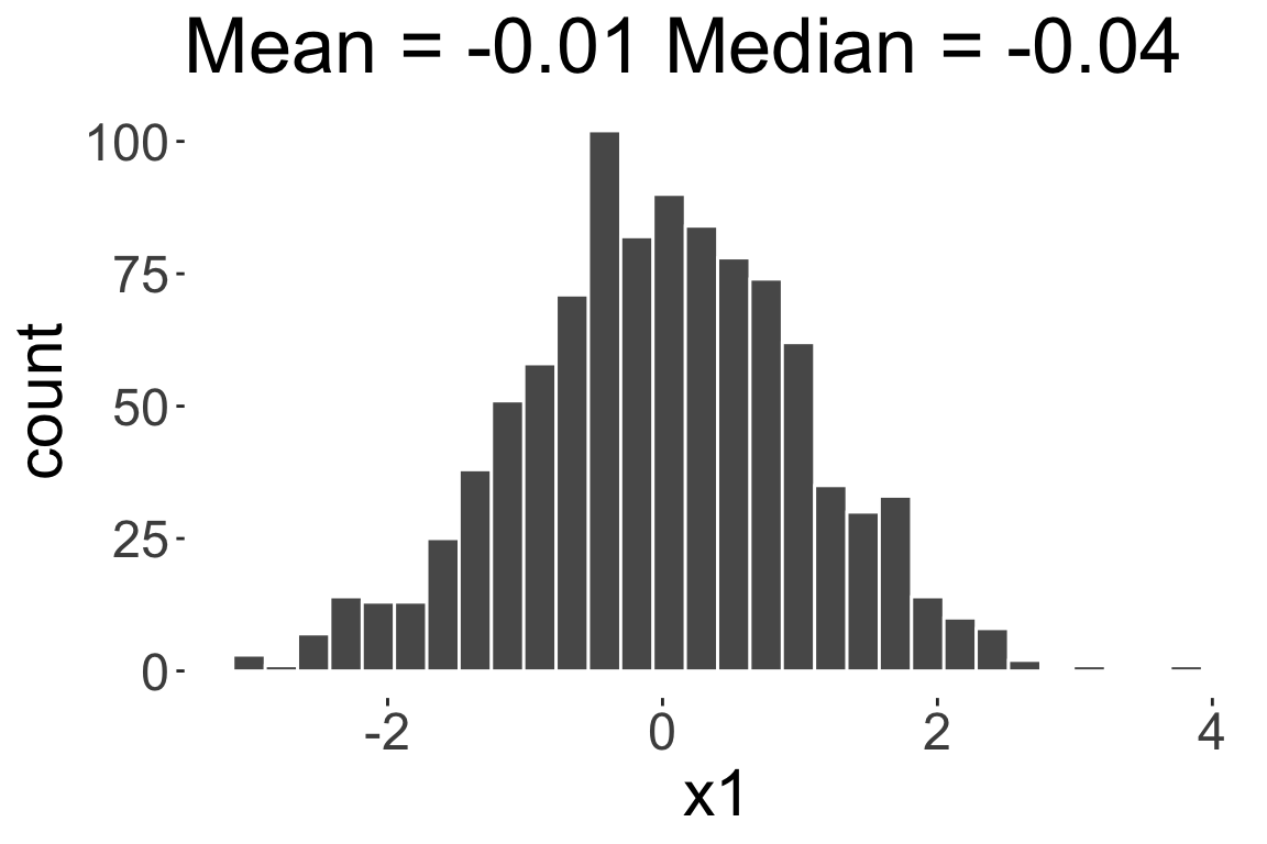
Positively skewed or
Right skewed
Negatively skewed or
Left skewed
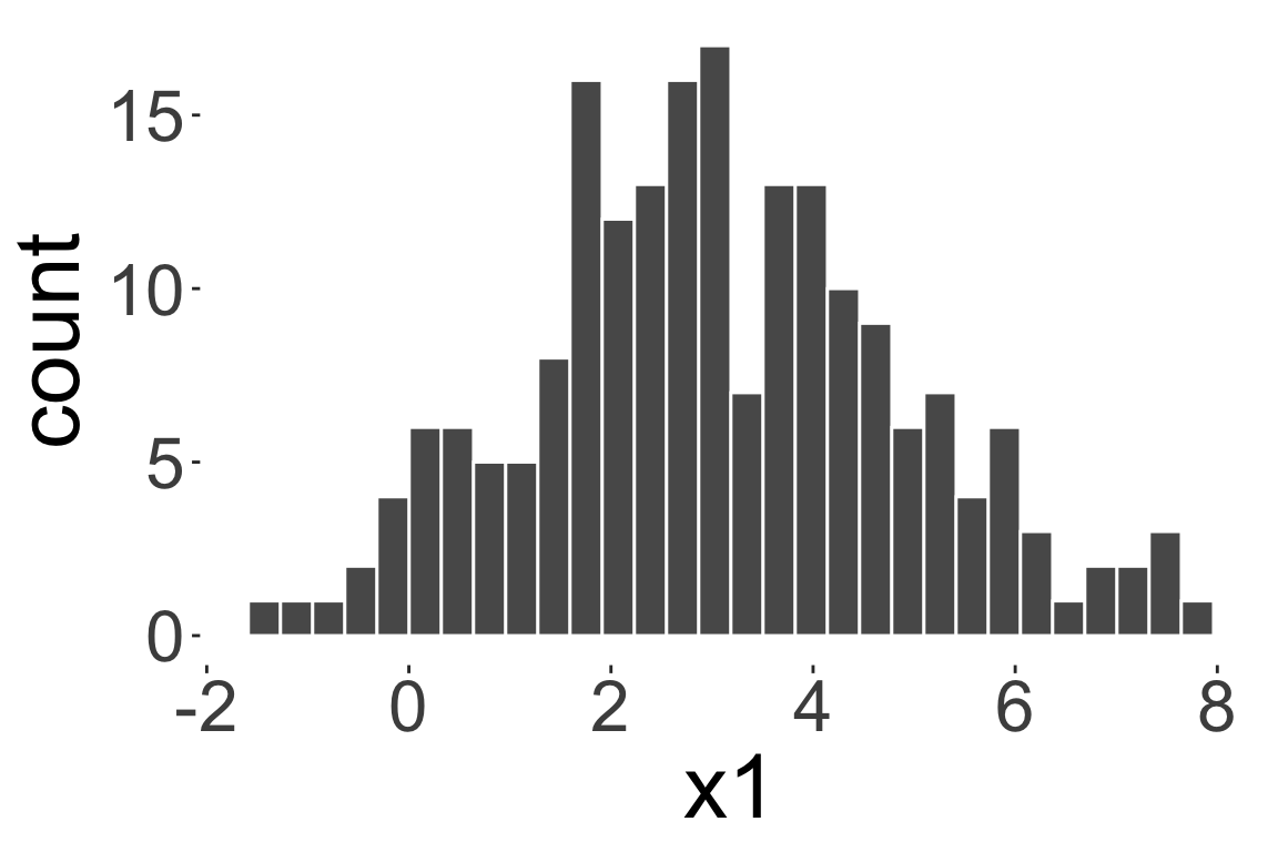
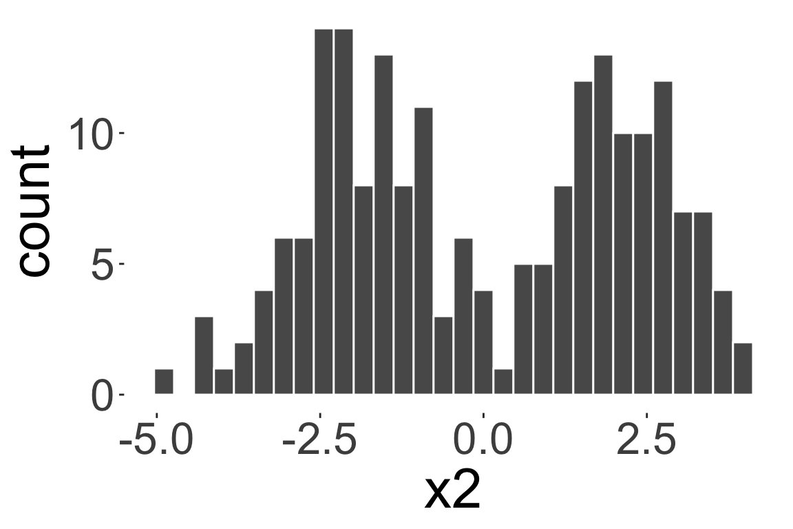
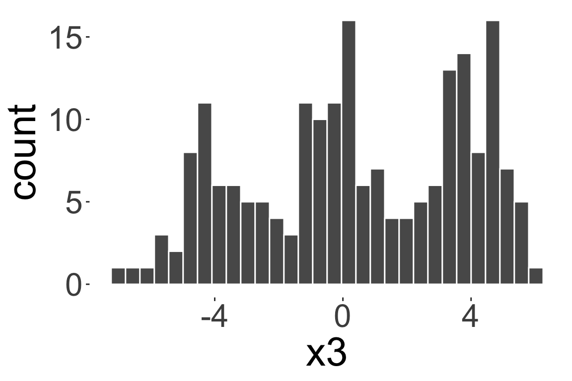
Modality
The sample mode is the value with the highest frequency.
- Mode is useful for categorical data.
- For numerical data, mode is less useful as there may be no repeated values.
- However, we can look at the modality of a distribution: number of peaks in the distribution.
Unimodal distribution
Bimodal distribution
Multimodal distribution
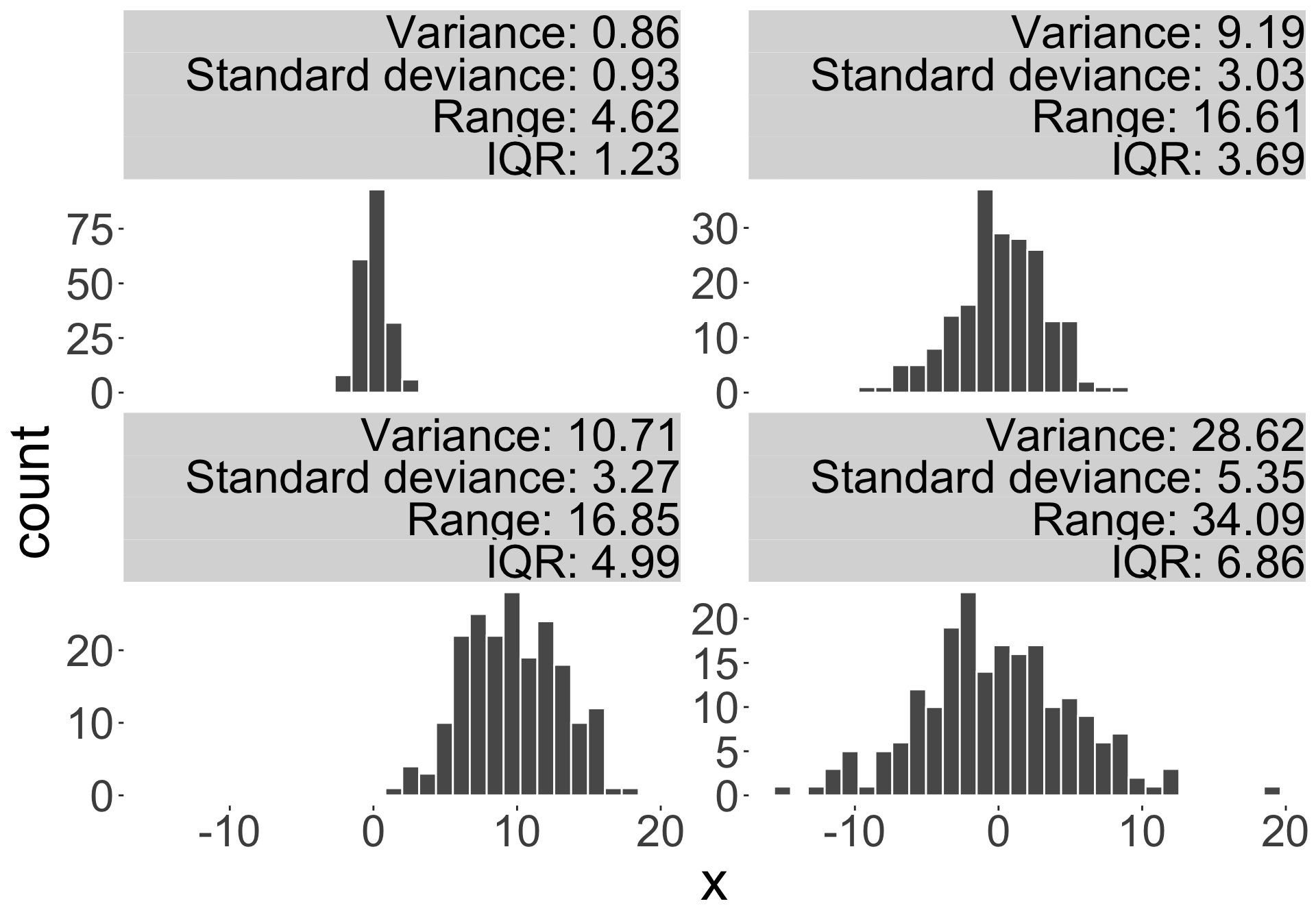
A measure of dispersion
A measure of dispersion/spread is a number representing the spread of data around a measure of central tendency.
- E.g. range, interquartile range (IQR), variance, standard deviation.
Measure of dispersions
- Sample deviation: the distance of an observation from its mean \(x_i-\bar{x}\)
- Sample variance: \[s^2 = \frac{1}{n-1}\sum_{i=1}^n (x_i - \bar{x})^2.\]
- Sample standard deviation: the square root of sample variance \(s\)
- Conveys similar information as variance, but measure of units is the same as the data
- The range is the difference between the maximum and minimum values in the dataset.
- The interquartile range (IQR) is the difference between the third quartile and the first quartile (\(Q_3 - Q_1\)).
Population variance: \[\sigma^2 = \frac{1}{N}\sum_{i=1}^{N} (x_{i'} - \mu)^2.\]
Boxplots

L = \(Q_1 - 1.5 \times IQR\)
U = \(Q_3 + 1.5 \times IQR\)
- Boxplot do not work well for small datasets and certainly not for \(n < 5\).
- Boxplots are poor at showing multimodal distributions.
Case study STAT1003 mark distribution
How hard is STAT1003 at ANU for a typical undergraduate student?
Here is a sample assignment and quiz marks:
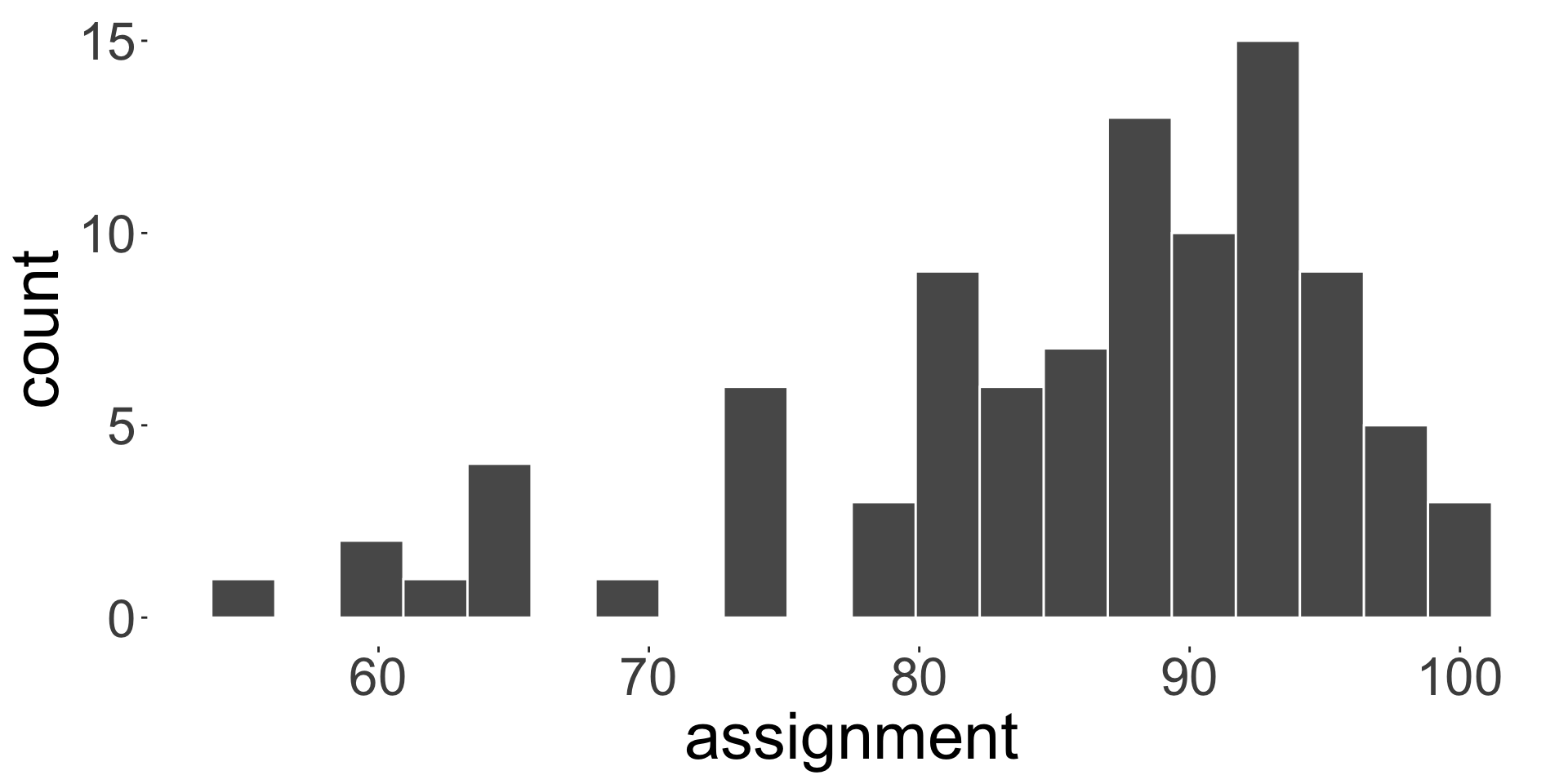
Five number summary: (55, 80, 88, 93, 100)
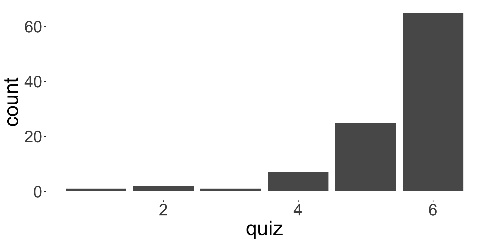
Mode: 6
- Note: five number summary is (minimum, \(Q_1\), median, \(Q_3\), maximum)
- What do you think based on the distribution of marks for assignment and quiz?